How to use the default Feathers item renderer with List, DataGrid, Tree, and GroupedList (AS3/Starling version)
The DefaultListItemRenderer, DefaultTreeItemRenderer, and DefaultGroupedListItemRenderer classes provide a basic way to display items from data collections in the List, Tree, and GroupedList components. These default item renderers are derived from the same base class, and their functionality is virtually identical.
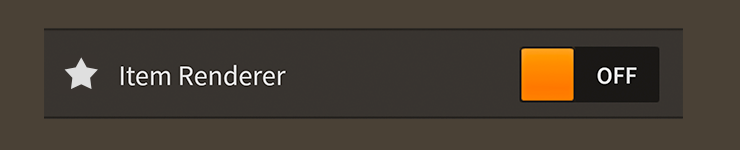
DefaultListItemRenderer component skinned with MetalWorksMobileThemeIn many of the examples below, code and descriptions will refer to the
DefaultListItemRendererclass and theIListItemRendererinterface, which are both used by theListcomponent. When using aTreecomponent, you should substitute theDefaultTreeItemRendererclass and theITreeItemRendererinterface instead. When using aGroupedListcomponent, you should substitute theDefaultGroupedListItemRendererclass and theIGroupedListItemRendererinterface instead.Whether using a
List,DataGrid,Tree, or aGroupedList, the default item renderers will have all of the same properties that are used in the examples below. The differences are entirely behind the scenes.
The Basics
Item renderers are managed by a List, DataGrid, Tree, or GroupedList component, and you generally don't add them to the display list directly. To customize properties on a default item renderer, you can use the list's itemRendererFactory:
list.itemRendererFactory = function():IListItemRenderer
{
    var itemRenderer:DefaultListItemRenderer = new DefaultListItemRenderer();
    itemRenderer.labelField = "text";
    return itemRenderer;
}
In the next section, we'll look at several examples of properties that we can set in the itemRendererFactory.
Children of an item renderer
An item renderer provides up to three children to display data. A label, an icon, and an accessory. A label must always display a string in a text renderer. However, both the icon and the accessory have three different ways to display data. They may display either a texture or URL in an ImageLoader, a string in a text renderer, or they can add an arbitrary display object, like a Feathers component, as a child.
Label
The labelField property displays a string in the primary text renderer.
Consider the following item in a data provider:
{ text: "Example Item" }
For an item renderer to display "Example Item" string, it needs to know about the item's text property:
itemRenderer.labelField = "text";
The default item renderer also has a labelFunction property that may be used to generate a string dynamically.
Icon
The icon is typically intended for displaying a texture (either preloaded or from a URL) in an ImageLoader component. However, for convenience, it may also display a string in another text renderer, or it may add any Starling display object as a child.
When loading a texture or URL, the item renderer will create and manage its own internal ImageLoader instance. If the texture is loaded from a URL, we do not need to dispose this texture when we are finished with it. The texture will be disposed when the ImageLoader is disposed. If we pass in a preloaded texture, it is our responsibility to dispose it when needed.
To display a texture or a URL, you may use the iconSourceField property.
Consider the following item from the data provider:
{ label: "Example Label", thumbnail: atlas.getTexture( "texture-name" ) }
For an item renderer to display the texture from the altas, it needs to know about the item's thumbnail property:
itemRenderer.iconSourceField = "thumbnail";
Similar to the labelField property, the iconLabelField property can be used to display a string in another text renderer. This can be a convenient way to display another line of text, or it could even be used to display symbols using icon fonts.
Finally, if you need to display a Feathers component or any other type of Starling display object, you can use the iconField property.
Consider the following code where a Slider component is included in a list's data provider:
var slider:Slider = new Slider();
slider.minimum = 0;
slider.maximum = 10;
slider.step = 1;
slider.value = 0;

list.dataProvider = new ArrayCollection(
[
    { label: "Example Label", control: slider }
];
For an item renderer to add the display object as a child, it needs to know about the item's control property:
itemRenderer.iconField = "control";
When using iconField, it's important to understand that the display object in the data provider will not be automatically disposed when the item renderer or the list is disposed. This display object may need to be used in another list later, and Feathers cannot know whether it is safe to dispose it, similar to how a starling.display.Image cannot dispose its starling.textures.Texture. To avoid memory leaks, remember to dispose any display objects included in the list's data provider when the list is disposed. The dispose() function on the data provider makes it easy to dispose display objects in an IListCollection.
Finally, it's possible to skin the icon without passing it through the data provider. For example, you might want to display a checkmark as the icon when an item renderer is selected. Set the itemHasIcon property to false, and you can skin the icon using defaultIcon and setIconForState() just like you would for a button.
Accessory
In addition to the label and the icon, the default item renderer can display a third child, an accessory. This is a display object that is added as a child and it is often meant to be interactive in some way. For instance, you might create a list of settings with labels on the left and some user interface controls like sliders and toggle switches on the right.
When using interactive accessories, it's a good idea to set the list's isSelectable property to false to avoid touch conflicts and user confusion. When a list displays interactive accessories, it may not be obvious that the items in a list may be touched to select them too.
Similar to icons, for extra convenience and flexibility, an accessory may be a text renderer that displays a string, an ImageLoader that displays a texture, or a Starling display object that is added as a child. You may use the accessorySourceField property, the accessoryLabelField property, and the accessoryField property. These properties work the same as they would for icons.
Similar to iconField, a display object in the list's data provider that is displayed using accessoryField will not be automatically disposed when the item renderer or the list is disposed. See the note above about iconField for details.
Finally, similar to itemHasIcon, it's possible to skin the accessory without passing it through the data provider by setting itemHasAccessory to false. You can skin the accessory using defaultAccessory and setAccessoryForState().
Skinning a default item renderer
The DefaultListItemRenderer class is a subclass of the ToggleButton component. Like a button, the default item renderer can change its background skin based on the touch state, and it supports different background skins when selected too. Similarly, an item renderer may have both a label and an icon, and all of the layout options used by buttons for alignment, gap, and padding apply to an item renderer too. For full details about these inherited properties, see How to use the Button component and How to use the ToggleButton component. For full details about which properties are available to item renderers, see the DefaultListItemRenderer API reference. We'll look at a few of the most common ways of styling an item renderer below.
Font styles
If the item renderer's accessory is a label set using accessoryLabelField or accessoryLabelFunction, we can customize its font styles using the accessoryLabelFontStyles property.
itemRenderer.accessoryLabelFontStyles = new TextFormat( "Helvetica", 20, 0x3c3c3c );
Pass in a starling.text.TextFormat object, which will work with any type of text renderer.
If the accessory label should use different font styles when the item renderer is disabled, you may set the accessoryLabelDisabledFontStyles property too:
itemRenderer.accessoryLabelDisabledFontStyles = new TextFormat( "Helvetica", 20, 0x9a9a9a );
Finally, we can even customize the accessory label's font styles for each of the item renderer's specific states:
itemRenderer.setAccessoryLabelFontStylesForState( ButtonState.DOWN,
	new TextFormat( "Helvetica", 20, 0xcc0000 ) );
Using the code above, the color of the accessor label will change when the item renderer is pressed, and the state changes to ButtonState.DOWN.
When font styles aren't available for a specific state, the item renderer will use the default accessoryLabelFontStyles as a fallback. For example, we haven't provided font styles for ButtonState.HOVER, so the default styles will be used.
Similarly, if the item renderer's icon is a label set using iconLabelField or iconLabelFunction, its font styles may be customized too. Use the iconLabelFontStyles and iconLabelDisabledFontStyles properties, or the setIconLabelFontStylesForState() function.
Layout with an accessory
Buttons may have two children, a label text renderer and an icon, but the default item renderers add a third child, known as an accessory. Earlier, we looked at how an accessory may be passed in through the data provider. Now, let's look at some of the layout options available when adding an accessory into the mix.
Positioning the accessory in the item renderer's layout is very similar to positioning the icon relative to the label text renderer. The default item renderer has an accessoryPosition property that will allow it to be positioned relative to the other children. The accessoryGap property defines the gap in pixels between the accessory and the other children.
The
iconPositionandgapproperties provided by theButtonsuperclass may also be used by item renderers to position the icon.
When displaying all three children that the default item renderer supports (the label text renderer, the icon, and the accessory), you can use the layoutOrder property to customize the order that the children are positioned in the layout. By default, the label text renderer is positioned first, followed by the icon (relative to the label), and finally, the accessory is positioned last (relative to the combined bounding box of the label and the icon). Alternatively, you can change the order so that the label text renderer is positioned first, followed by the accessory (relative to the label), and the icon is positioned last (relative to the combined bounding box of the label and the accessory).
Related Links
feathers.controls.renderers.DefaultListItemRendererAPI Documentationfeathers.controls.renderers.DefaultTreeItemRendererAPI Documentationfeathers.controls.renderers.DefaultGroupedListItemRendererAPI DocumentationCreating custom item renderers for the Feathers
List,DataGrid,TreeandGroupedListcomponents