How to use the Header component (AS3/Starling version)
The Header component displays an optional title and a region on the left and right sides for extra controls (usually buttons for navigation).
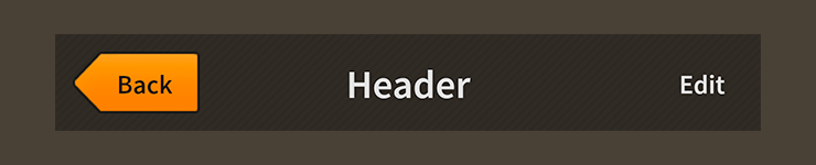
Header component skinned with MetalWorksMobileThemeThe Basics
First, let's create a Header control, give it a title, and add it to the display list.
var header:Header = new Header();
header.title = "Settings";
this.addChild( header );
Next, we'll add a back button to the left side of the header.
var backButton:Button = new Button();
backButton.label = "Back";
backButton.addEventListener( Event.TRIGGERED, backButton_triggeredHandler );

header.leftItems = new <DisplayObject>[ backButton ];
Notice that we create our button just like we would any regular button, including adding an event listener, except we don't add it to the display list. We pass it to the leftItems property in a Vector.<DisplayObject> and the header manages adding it as a child and keeping it in the header's layout.
We could add additional buttons or controls to the rightItems region or the centerItems region, if desired.
Normally, the title text renderer is displayed in the center region of the
Header. If thecenterItemsproperty is not empty, the title will be hidden. ThetitleAlignproperty, which we'll learn how to use in a moment, may be used to reposition the title on the left or right side so that it doesn't conflict with the center items.
Skinning a Header
A header offers a number of properties that may be used to customize its appearance. For full details about which properties are available, see the Header API reference. We'll look at a few of the most common ways of styling a header below.
Font styles
The font styles of the header's title may be customized using the fontStyles property.
header.fontStyles = new TextFormat( "Helvetica", 20, 0x3c3c3c );
Pass in a starling.text.TextFormat object, which will work with any type of text renderer.
If the header's title should use different font styles when the header is disabled, you may set the disabledFontStyles property too:
header.disabledFontStyles = new TextFormat( "Helvetica", 20, 0x9a9a9a );
Background skins
Let's give the header a background skin that stretches to fill the entire width and height of the header. In the following example, we pass in a starling.display.Image, but the skin may be any Starling display object:
var skin:Image = new Image( texture );
skin.scale9Grid = new Rectangle( 2, 2, 1, 6 );
header.backgroundSkin = skin;
It's as simple as setting the backgroundSkin property.
We can give the header a different background when it is disabled:
var skin:Image = new Image( texture );
skin.scale9Grid = new Rectangle( 1, 3, 2, 6 );
header.backgroundDisabledSkin = skin;
The backgroundDisabledSkin is displayed when the header is disabled. If the backgroundDisabledSkin isn't provided to a disabled header, it will fall back to using the backgroundSkin in the disabled state.
Layout
By default, the header's title text renderer appears in the center. The titleAlign property may be set to HorizontalAlign.LEFT to position the title to the left. If the leftItems property is not empty, the title will still appear on the left, but it will be positioned after the left items. Similarly, we can use HorizontalAlign.RIGHT to align the title to the right side of the header. If the rightItems property is not empty, the title will still appear on the right, but it will be positioned before the right items.
Let's align the title to the right:
header.titleAlign = HorizontalAlign.RIGHT;
Similar to many Feathers components, the Header provides gap and various padding values for layouts.
header.gap = 10;
header.paddingTop = 15;
header.paddingRight = 20;
header.paddingBottom = 15;
header.paddingLeft = 20;
If all four padding values should be the same, you may use the padding property to set them all at once:
header.padding = 20;