How to use the Panel component (AS3/Starling version)
The Panel component is a container that supports layout and scrolling, similar to ScrollContainer, but it also adds a header and an optional footer above and below the content, respectively. This component is useful for creating windows and dialogs and making any kind of grouping that needs a header or title.
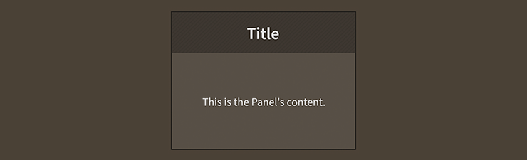
Panel component skinned with MetalWorksMobileThemeThe Basics
First, let's create a Panel container and add it to the display list:
var panel:Panel = new Panel();
this.addChild( panel );
We can easily add a title to the panel's header by setting the title property.
panel.title = "Tools";
A Panel works a lot like any DisplayObjectContainer, so you can use the standard addChild(), removeChild() and other display list manipulation functions.
var xPosition:Number = 0;
for(var i:int = 0; i < 5; i++)
{
    var quad:Quad = new Quad( 100, 100, 0xff0000 );
    quad.x = xPosition;
    panel.addChild( quad );
    xPosition += quad.width + 10;
}
The children of a Panel do not need to be Feathers UI controls. As you can see above, we've added some Starling Quad instances.
By default, the Panel will automatically resize itself to fit the area that the children occupy (plus its header and footer). We can set the width and height manually, if desired, to override this behavior:
panel.width = 200;
panel.height = 200;
The Header
By default, a panel's header sub-component is an instance of the Header class. However, it can be any Feathers component. The only restriction is that the header must appear on the top edge of the panel and fill the entire panel width.
You can customize the panel's header in a couple of different ways. The first way is to provide a custom headerFactory:
panel.headerFactory = function():Header
{
    var header:Header = new Header();

    var closeButton:Button = new Button();
    closeButton.label = "Close";
    closeButton.addEventListener( Event.TRIGGERED, closeButton_triggeredHandler );
    header.rightItems = new <DisplayObject>[ closeButton ];

    return header;
}
You can set any properties that you desire on the header inside this factory (including skins, but if you're using a theme, watch out for conflicts).
Remember, the panel's header does not need to be a Header instance. It simply needs to be a Feathers component. If you wanted to make a Panel with a clickable header, you could provide a headerFactory that returns a Button:
panel.headerFactory = function():Button
{
    var button:Button = new Button();
    button.addEventListener( Event.TRIGGERED, panelHeaderButton_triggeredHandler );
    return button;
}
In this case, you should also update the headerTitleField property so that the panel's title is correctly displayed by the button's label:
panel.headerTitleField = "label";
Using a button as the panel's header might be useful for creating a panel that can collapse and expand.
The Footer
By default, a panel doesn't have a footer. However, if you want to add a footer, it may be any Feathers component. The only restriction is that the footer must appear on the bottom edge of the panel and fill the entire panel width.
You can customize the panel's footer in two ways. The first way is to provide a custom footerFactory:
panel.footerFactory = function():LayoutGroup
{
    var footer:LayoutGroup = new LayoutGroup();
    footer.styleNameList.add( LayoutGroup.ALTERNATE_STYLE_NAME_TOOLBAR );
    return footer;
}
You can set any properties that you desire on the footer inside this factory (including skins, but if you're using a theme, watch out for conflicts!). In this example, we're using a [LayoutGroup] with a "toolbar" alternate style name. Typically, a theme will use this style name to make a LayoutGroup look similar to Header and give it a horizontal layout (the exact behavior depends on the theme, but this is the most common behavior).
Layout
We manually positioned the quads in the example code above. Instead, let's apply a HorizontalLayout to the children of a Panel to do the positioning manually:
var layout:HorizontalLayout = new HorizontalLayout();
layout.gap = 10;
panel.layout = layout;
Here, we've set the gap property, but HorizontalLayout provides many more useful features. See How to use HorizontalLayout with Feathers containers for complete details.
Feathers comes with a number of different [/api-reference/feathers/layout/package-detail.html), in addition to
HorizontalLayout.
Skinning a Panel
The skins for a Panel control are divided into the header, the content, and the footer. Additionally, a panel may have background skins and various other styles. For full details about what skin and style properties are available, see the Panel API reference. We'll look at a few of the most common ways of styling a panel below.
Background skins
We can give the Panel a background skin that stretches to fill the entire width and height of the panel. In the following example, we pass in a starling.display.Image, but the skin may be any Starling display object:
var skin:Image = new Image( texture );
skin.scale9Grid = new Rectangle( 2, 2, 1, 6 );
panel.backgroundSkin = skin;
It's as simple as setting the backgroundSkin property.
We can give the Panel a different background when it is disabled:
var skin:Image = new Image( texture );
skin.scale9Grid = new Rectangle( 1, 3, 2, 6 );
panel.backgroundDisabledSkin = skin;
The backgroundDisabledSkin is displayed when the panel is disabled. If the backgroundDisabledSkin isn't provided to a disabled panel, it will fall back to using the backgroundSkin in the disabled state.
Internal Layout
Padding may be added around the edges of the panel's content. This padding is different than any type of padding that may be provided by the layout. The layout padding is applied inside the panel's content, but the panel's padding is applied outside of the content, and is generally used to show a bit of the background as a border around the content.
panel.paddingTop = 15;
panel.paddingRight = 20;
panel.paddingBottom = 15;
panel.paddingLeft = 20;
If all four padding values should be the same, you may use the padding property to quickly set them all at once:
panel.padding = 20;
Skinning the Header
This section only explains how to access the header sub-component. The header may be any type of Feathers control. Please read the appropriate documentation for full details about the skinning properties that are available on the component that is used for the header.
For the default header, please read How to use the
Headercomponent for full details about the skinning properties that are available onHeadercomponents.
With a Theme
If you're creating a theme, you can target the Panel.DEFAULT_CHILD_STYLE_NAME_HEADER style name.
getStyleProviderForClass( Header )
    .setFunctionForStyleName( Panel.DEFAULT_CHILD_STYLE_NAME_HEADER, setPanelHeaderStyles );
The styling function might look like this:
private function setPanelHeaderStyles( header:Header ):void
{
    header.fontStyles = new TextFormat( "Helvetica", 20, 0xcc0000 );
}
You can override the default style name to use a different one in your theme, if you prefer:
panel.customHeaderStyleName = "custom-header";
You can set the function for the customHeaderStyleName like this:
getStyleProviderForClass( Header )
    .setFunctionForStyleName( "custom-header", setPanelCustomHeaderStyles );
Without a Theme
If you are not using a theme, you can use headerFactory to provide skins for the panel's header:
panel.headerFactory = function():Header
{
    var header:Header = new Header();

    //skin the header here, if not using a theme
    header.fontStyles = new TextFormat( "Helvetica", 20, 0xcc0000 );

    return header;
}
Skinning the Footer
This section only explains how to access the footer sub-component. The footer may be any type of Feathers control. Please read the appropriate documentation for full details about the skinning properties that are available on the component that is used for the footer.
With a Theme
If you're creating a theme, you can target the Panel.DEFAULT_CHILD_STYLE_NAME_FOOTER style name. In the following example, we'll assume that the footer is a LayoutGroup, but it could be any type of Feathers component.
getStyleProviderForClass( LayoutGroup )
    .setFunctionForStyleName( Panel.DEFAULT_CHILD_STYLE_NAME_FOOTER, setPanelFooterStyles );
The styling function might look like this:
private function setPanelFooterStyles( footer:LayoutGroup ):void
{
    var skin:Image = new Image( texture );
    skin.scale9Grid = new Rectangle( 2, 3, 1, 6 );
    footer.backgroundSkin = skin;
}
You can override the default style name to use a different one in your theme, if you prefer:
panel.customFooterStyleName = "custom-footer";
You can set the function for the customFooterStyleName like this:
getStyleProviderForClass( ScrollContainer )
    .setFunctionForStyleName( "custom-footer", setPanelCustomFooterStyles );
Without a Theme
If you are not using a theme, you can use footerFactory to provide skins for the panel's footer:
panel.footerFactory = function():LayoutGroup
{
    var footer:LayoutGroup = new LayoutGroup();

    //skin the footer here, if not using a theme
    var skin:Image = new Image( texture );
    skin.scale9Grid = new Rectangle( 2, 3, 1, 6 );
    footer.backgroundSkin = skin;

    return footer;
}
Skinning the Scroll Bars
This section only explains how to access the horizontal scroll bar and vertical scroll bar sub-components. Please read How to use the ScrollBar component (or SimpleScrollBar) for full details about the skinning properties that are available on scroll bar components.
With a Theme
If you're creating a theme, you can target the Scroller.DEFAULT_CHILD_STYLE_NAME_HORIZONTAL_SCROLL_BAR style name for the horizontal scroll bar and the Scroller.DEFAULT_CHILD_STYLE_NAME_VERTICAL_SCROLL_BAR style name for the vertical scroll bar.
getStyleProviderForClass( ScrollBar )
    .setFunctionForStyleName( Scroller.DEFAULT_CHILD_STYLE_NAME_HORIZONTAL_SCROLL_BAR, setHorizontalScrollBarStyles );
getStyleProviderForClass( ScrollBar )
    .setFunctionForStyleName( Scroller.DEFAULT_CHILD_STYLE_NAME_VERTICAL_SCROLL_BAR, setVerticalScrollBarStyles );
The styling function for the horizontal scroll bar might look like this:
private function setHorizontalScrollBarStyles(scrollBar:ScrollBar):void
{
    scrollBar.trackLayoutMode = TrackLayoutMode.SINGLE;
}
You can override the default style names to use different ones in your theme, if you prefer:
panel.customHorizontalScrollBarStyleName = "custom-horizontal-scroll-bar";
panel.customVerticalScrollBarStyleName = "custom-vertical-scroll-bar";
You can set the function for the customHorizontalScrollBarStyleName and the customVerticalScrollBarStyleName like this:
getStyleProviderForClass( ScrollBar )
    .setFunctionForStyleName( "custom-horizontal-scroll-bar", setCustomHorizontalScrollBarStyles );
getStyleProviderForClass( ScrollBar )
    .setFunctionForStyleName( "custom-vertical-scroll-bar", setCustomVerticalScrollBarStyles,  );
Without a Theme
If you are not using a theme, you can use horizontalScrollBarFactory and verticalScrollBarFactory to provide skins for the panel's scroll bars:
panel.horizontalScrollBarFactory = function():ScrollBar
{
    var scrollBar:ScrollBar = new ScrollBar();

    //skin the scroll bar here
    scrollBar.trackLayoutMode = TrackLayoutMode.SINGLE;

    return scrollBar;
}
Customize scrolling behavior
A number of properties are available to customize scrolling behavior and the scroll bars.
Interaction Modes
Scrolling containers provide two main interaction modes, which can be changed using the interactionMode property.
By default, you can scroll using touch, just like you would on many mobile devices including smartphones and tablets. This mode allows you to grab the container anywhere within its bounds and drag it around to scroll. This mode is defined by the constant, ScrollInteractionMode.TOUCH.
Alternatively, you can set interactionMode to ScrollInteractionMode.MOUSE. This mode allows you to scroll using the horizontal or vertical scroll bar sub-components. You can also use the mouse wheel to scroll vertically.
Finally, you can set interactionMode to ScrollInteractionMode.TOUCH_AND_SCROLL_BARS. This mode allows you to scroll both by dragging the container's content and by using the scroll bars.
Scroll Bar Display Mode
The scrollBarDisplayMode property controls how and when scroll bars are displayed. This value may be overridden by the scroll policy, as explained below.
The default value is ScrollBarDisplayMode.FLOAT, which displays the scroll bars as an overlay above the view port's content, rather than affecting the size of the view port. When the scroll bars are floating, they fade out when the container is not actively scrolling. This is a familiar behavior for scroll bars in the touch interaction mode. In the mouse interaction mode, the scroll bars will appear when the mouse hovers over them and then disappear when the hover ends.
To completely hide the scroll bars, but still allow scrolling, you can set scrollBarDisplayMode to ScrollBarDisplayMode.NONE.
If you want the scroll bars to always be visible outside of the content in a fixed position, you can set scrollBarDisplayMode to ScrollBarDisplayMode.FIXED. This is best for traditional desktop scrollable content.
Finally, you can set scrollBarDisplayMode to ScrollBarDisplayMode.FIXED_FLOAT to display the scroll bar as an overlay above the view port's content, but it does not fade away.
Scroll Policies
The two previous properties control how scrolling works. The horizontalScrollPolicy and verticalScrollPolicy properties control whether scrolling is enabled or not.
The default scroll policy for both directions is ScrollPolicy.AUTO. If the content's width is greater than the view port's width, the panel may scroll horizontally (same for height and vertical scrolling). If not, then the panel will not scroll in that direction. In addition to the scrollBarDisplayMode, this can affect whether the scroll bar is visible or not.
You can completely disable scrolling in either direction, set the scroll policy to ScrollPolicy.OFF. The scroll bar will not be visible, and the panel won't scroll, even if the content is larger than the view port.
Finally, you can ensure that scrolling is always enabled by setting the scroll policy to ScrollPolicy.ON. If combined with hasElasticEdges in the touch interaction mode, it will create a playful edge that always bounces back, even when the content is smaller than the view port. If using the mouse interaction mode, the scroll bar may always be visible under the same circumstances, though it may be disabled if the content is smaller than the view port.
Paging
Set the snapToPages property to true to make the scroll position snap to the nearest full page. A page is defined as a multiple of the view ports width or height. If the view port is 100 pixels wide, then the first horizontal page starts at 0 pixels, the second at 100, and the third at 200.
The pageWidth and pageHeight properties may be used to customize the size of a page. Rather than using the full view port width or height, any pixel value may be specified for page snapping.