How to use the ToggleSwitch component (AS3/Starling version)
The ToggleSwitch component switches between on and off states. It can be considered a stylized alternative to a Check control that is especially relevant when targeting touch screens. The thumb may be dragged from side to side, or it may be tapped to change selection.
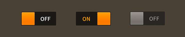
ToggleSwitch components skinned with MetalWorksMobileThemeThe Basics
First, let's create a toggle switch, select it, and add it to the display list.
var toggle:ToggleSwitch = new ToggleSwitch();
toggle.isSelected = true;
this.addChild( toggle );
The isSelected property indicates if the toggle switch is on (true) or off (false). Add a listener to Event.CHANGE to know when the isSelected property changes:
toggle.addEventListener( Event.CHANGE, toggle_changeHandler );
The listener might look something like this:
function toggle_changeHandler( event:Event ):void
{
    var toggle:ToggleSwitch = ToggleSwitch( event.currentTarget );
    trace( "toggle.isSelected changed:", toggle.isSelected );
}
Skinning a ToggleSwitch
The skins for a ToggleSwitch control are divided into the thumb, labels for off and on text, and one or two tracks. For full details about what skin and style properties are available, see the ToggleSwitch API reference. We'll look at a few of the most common ways of styling a toggle switch below.
Font styles
The font styles of the on and off labels may be customized using the onLabelFontStyles and offLabelFontStyles properties, respectively.
toggle.onLabelFontStyles = new TextFormat( "Helvetica", 20, 0xcc0000 );
toggle.offLabelFontStyles = new TextFormat( "Helvetica", 20, 0x000000 );
Pass in a starling.text.TextFormat object, which will work with any type of text renderer.
If the labels should use different font styles when it is disabled, you may set the onLabelDisabledFontStyles and offLabelDisabledFontStyles properties too:
toggle.onLabelDisabledFontStyles = new TextFormat( "Helvetica", 20, 0x9a9a9a );
toggle.offLabelDisabledFontStyles = new TextFormat( "Helvetica", 20, 0x9a9a9a );
Track(s) and Layout
The toggle switch's track is made from either one or two buttons, depending on the value of the trackLayoutMode property. The default value of this property is TrackLayoutMode.SINGLE, which creates a single track that fills the entire width and height of the toggle switch.
If we'd like to have separate buttons for both sides of the track (one for the on side and another for the off side), we can set trackLayoutMode to TrackLayoutMode.SPLIT. In this mode, the width or height of each track (depending on the direction of the toggle switch) is adjusted as the thumb moves to ensure that the two tracks always meet at the center of the thumb.
TrackLayoutMode.SINGLE is often best for cases where the track's appearance is mostly static. When you want down or hover states for the track, TrackLayoutMode.SPLIT works better because the state will only change on one side of the thumb, making it more visually clear to the user what is happening.
When the value of trackLayoutMode is TrackLayoutMode.SINGLE, the toggle switch will have a on track, but it will not have a off track. The on track will fill the entire region that is draggable.
Skinning the Thumb
This section only explains how to access the thumb sub-component. Please read How to use the Button component for full details about the skinning properties that are available on Button components.
With a Theme
If you're creating a theme, you can target the ToggleSwitch.DEFAULT_CHILD_STYLE_NAME_THUMB style name.
getStyleProviderForClass( Button )
    .setFunctionForStyleName( ToggleSwitch.DEFAULT_CHILD_STYLE_NAME_THUMB, setToggleSwitchThumbStyles );
The styling function might look like this:
private function setToggleSwitchThumbStyles( thumb:Button ):void
{
    var skin:ImageSkin = new ImageSkin( texture );
    skin.scale9Grid = new Rectangle( 2, 3, 1, 6 );
    thumb.defaultSkin = skin;
}
You can override the default style name to use a different one in your theme, if you prefer:
toggle.customThumbStyleName = "custom-thumb";
You can set the function for the customThumbStyleName like this:
getStyleProviderForClass( Button )
    .setFunctionForStyleName("custom-thumb", setToggleSwitchCustomThumbStyles );
Without a Theme
If you are not using a theme, you can use thumbFactory to provide skins for the toggle switch's thumb:
toggle.thumbFactory = function():Button
{
    var thumb:Button = new Button();

    //skin the thumb here, if not using a theme
    var skin:ImageSkin = new ImageSkin( texture );
    skin.scale9Grid = new Rectangle( 2, 3, 1, 6 );
    thumb.defaultSkin = skin;

    return thumb;
}
Skinning the On Track
This section only explains how to access the on track sub-component. Please read How to use the Button component for full details about the skinning properties that are available on Button components.
With a Theme
If you're creating a theme, you can target the ToggleSwitch.DEFAULT_CHILD_STYLE_NAME_ON_TRACK style name.
getStyleProviderForClass( Button )
    .setFunctionForStyleName( ToggleSwitch.DEFAULT_CHILD_STYLE_NAME_ON_TRACK, setToggleSwitchOnTrackStyles );
The styling function might look like this:
private function setToggleSwitchOnTrackStyles( track:Button ):void
{
    var skin:ImageSkin = new ImageSkin( texture );
    skin.scale9Grid = new Rectangle( 2, 3, 1, 6 );
    track.defaultSkin = skin;
}
You can override the default style name to use a different one in your theme, if you prefer:
toggle.customOnTrackStyleName = "custom-on-track";
You can set the function for the customOnTrackStyleName like this:
getStyleProviderForClass( Button )
    .setFunctionForStyleName( "custom-on-track", setToggleSwitchCustomOnTrackStyles );
Without a Theme
If you are not using a theme, you can use onTrackFactory to provide skins for the toggle switch's on track:
toggle.onTrackFactory = function():Button
{
    var button:Button = new Button();

    //skin the on track here, if not using a theme
    var skin:ImageSkin = new ImageSkin( texture );
    skin.scale9Grid = new Rectangle( 2, 3, 1, 6 );
    track.defaultSkin = skin;

    return button;
}
Skinning the Off Track
This section only explains how to access the off track sub-component. Please read How to use the Button component for full details about the skinning properties that are available on Button components.
The toggle switch's off track may be skinned similarly to the on track. The style name to use with themes is ToggleSwitch.DEFAULT_CHILD_STYLE_NAME_OFF_TRACK or you can customize the style name with customOffTrackStyleName. If you aren't using a theme, then you can use offTrackFactory.