How to use the Check component (AS3/Starling version)
The Check component is actually a ToggleButton component, but it is given a different visual appearance.
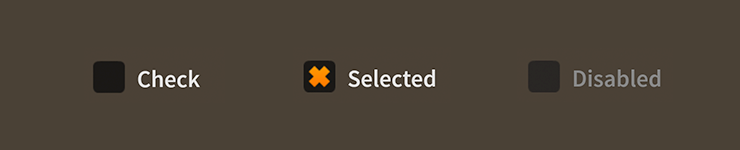
Check components skinned with MetalWorksMobileThemeThe Basics
A Check component can be created much like a ToggleButton:
var check:Check = new Check();
check.label = "Click Me";
check.isSelected = true;
this.addChild( check );
See How to use the ToggleButton component for a more detailed look at this component's capabilities.
Skinning a Check
A skinned Check component usually has no background (or a transparent one) and the touch states of the check are displayed through the icon skins. For full details about which properties are available, see the Check API reference.
As mentioned above,
Checkis a subclass ofToggleButton. For more detailed information about the skinning options available toCheck, see How to use theToggleButtoncomponent.