Feathers UI
  • Docs
  • API
  • Showcase
  • Blog
  • Community

›Components

Getting started

  • Installation
  • Hello World
  • Create a new project in…

    • Adobe Flash Builder
    • IntelliJ IDEA
    • FlashDevelop
    • Adobe Animate
  • Features

Components

  • Alert
  • AutoComplete
  • Button
  • ButtonGroup
  • Callout
  • Check
  • DataGrid
  • DateTimeSpinner
  • Default item renderers
  • Drawers
  • GroupedList
  • Header
  • ImageLoader
  • Label
  • LayoutGroup
  • List
  • NumericStepper
  • PageIndicator
  • Panel
  • PanelScreen
  • PickerList
  • ProgressBar
  • Radio
  • Screen
  • ScreenNavigator
  • ScrollBar
  • ScrollContainer
  • ScrollScreen
  • ScrollText
  • SimpleScrollBar
  • Slider
  • SpinnerList
  • StackScreenNavigator
  • TabBar
  • TabNavigator
  • TextArea
  • TextCallout
  • TextInput
  • Toast
  • ToggleButton
  • ToggleSwitch
  • Tree
  • WebView

Media components

  • SoundPlayer
  • VideoPlayer
  • More media controls

Text

  • Text renderers
  • Text editors
  • TextBlockTextRenderer
  • BitmapFontTextRenderer
  • TextFieldTextRenderer
  • StageTextTextEditor
  • TextBlockTextEditor
  • BitmapFontTextEditor
  • TextFieldTextEditor

Layouts

  • AnchorLayout
  • FlowLayout
  • HorizontalLayout
  • HorizontalSpinnerLayout
  • SlideShowLayout
  • TiledColumnsLayout
  • TiledRowsLayout
  • VerticalLayout
  • VerticalSpinnerLayout
  • WaterfallLayout
  • Custom layouts
  • ILayoutDisplayObject and ILayoutData (Starling version)
  • Custom layouts with virtualization

Skinning and themes

  • Skinning Feathers components
  • Introduction to themes
  • Extending the example themes
  • Creating custom themes
  • Style providers in-depth
  • Managing assets in themes
  • Original design sources for example themes

Custom components

  • Component lifecycle
  • Component anatomy
  • Validating with draw()
  • Custom item renderers
  • Custom item renderers with LayoutGroup
  • Custom item renderers with FeathersControl

Animation

  • Effects and animations
  • Navigator animated transitions

Miscellaneous

  • Displaying pop-ups
  • Focus management
  • Drag and drop
  • Tool-tips
  • Feathers SDK and MXML
  • Cookbook
  • FAQ
  • Prerelease
  • Deprecation policy
  • Beta policy

Contributing

  • Build Feathers from source
  • Coding conventions

Migration guides

  • 4.0 Migration Guide
  • 3.3 Migration Guide
  • 3.1 Migration Guide
  • 3.0 Migration Guide
  • 2.0 Migration Guide
Edit

How to use the SpinnerList component (Starling version)

The SpinnerList class extends the List component to allow the user to change the selected item by scrolling. Typically, the selected item is positioned in the center of the list, and it may be visually highlighted in some way. A SpinnerList will often loop infinitely, repeating its items as the user scrolls.

Screenshot of a Feathers SpinnerList component
A 
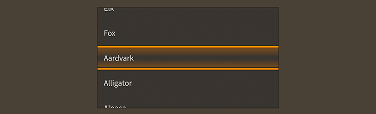
SpinnerList component skinned with MetalWorksMobileTheme
  • The Basics

  • Skinning a SpinnerList

The Basics

First, let's create a SpinnerList control and add it to the display list:

var list:SpinnerList = new SpinnerList();
this.addChild( list );

Similar to a List, we can pass an IListCollection implementation, such as ArrayCollection or VectorCollection, to the dataProvider property:

list.dataProvider = new ArrayCollection(
[
    { text: "Milk", thumbnail: textureAtlas.getTexture( "milk" ) },
    { text: "Eggs", thumbnail: textureAtlas.getTexture( "eggs" ) },
    { text: "Bread", thumbnail: textureAtlas.getTexture( "bread" ) },
    { text: "Chicken", thumbnail: textureAtlas.getTexture( "chicken" ) },
]);

We'll set up the label and icon in the item renderer the same way too:

list.itemRendererFactory = function():IListItemRenderer
{
    var itemRenderer:DefaultListItemRenderer = new DefaultListItemRenderer();
    itemRenderer.labelField = "text";
    itemRenderer.iconSourceField = "thumbnail";
    return itemRenderer;
};

We can listen for selection changes with Event.CHANGE:

list.addEventListener( Event.CHANGE, list_changeHandler );

Likewise, we can use the selectedIndex and selectedItem properties:

list.selectedIndex = 3;
trace( list.selectedItem.text ); //Chicken

One way that SpinnerList behaves differently is that selection may not be disabled. A regular List may be used to display read-only content without selection, but the purpose of SpinnerList is to select an item. If you attempt to set the isSelectable property to false, a runtime error will be thrown.

Skinning a SpinnerList

A spinner list provides a number of properties to customize its appearance. For full details about what skin and style properties are available, see the SpinnerList API reference. We'll look at a few of the most common properties below.

As mentioned above, SpinnerList is a subclass of List. For more detailed information about the skinning options available to SpinnerList, see How to use the List component.

Highlight the selected item

We can add a display object above the selected item to visually highlight it. For instance, we might display a border with a transparency in the center that reveals the selected item. In the following example, we pass in a starling.display.Image to the selectionOverlaySkin property, but the skin may be any Starling display object:

list.selectionOverlaySkin = new Image( texture );

This skin will be displayed in the center of the list, positioned either horizontally or vertically, depending on which way the list may be scrolled.

Related Links

  • feathers.controls.SpinnerList API Documentation

  • How to Use the List Component

Last updated on 1/28/2020
← SoundPlayerStackScreenNavigator →
  • The Basics
  • Skinning a SpinnerList
    • Highlight the selected item
  • Related Links
Feathers UI
Feathers UI
  • Downloads
  • Showcase
  • Testimonials
  • Premium Support
Documentation
  • Getting Started
  • API Reference
  • Samples
    Github
  • Source Code
  • Issue Tracker
Community
  • Forum
  • Discord
  • Stack Overflow
News & Updates
  • Blog (RSS, Atom)
  • Twitter
  • Mastodon
Make a Donation
  • Join Github Sponsors
  • Donate with PayPal
  • Buy a T-Shirt
Copyright © 2023 Bowler Hat LLC — Illustrations by unDraw.