How to use the Toast component (AS3/Starling version)
The Toast class allows the display of in-app notifications as pop-ups over all other content. A toast may contain a string message and optional action buttons, or it can display completely custom content. The toast will close automatically after a timeout, but it may also be configured to remain open indefinitely.
Toast component skinned with MetalWorksMobileThemeThe Basics
We create a Toast a bit differently than other components. Rather than calling a constructor, we call the static function, like Toast.showMessage(), Toast.showMessageWithActions(), or Toast.showContent().
Message
Let's see how this works by displaying some simple text in a Toast when we touch a button. First, let's create the button:
var button:Button = new Button();
button.label = "Click Me";
button.addEventListener( Event.TRIGGERED, button_triggeredHandler );
this.addChild( button );
Then, in the listener for the Event.TRIGGERED event, we create the toast:
function button_triggeredHandler( event:Event ):void
{
    var button:Button = Button( event.currentTarget );
    var toast:Toast = Toast.showMessage( "I am a toast" );
}
In addition to the string to display in the toast, Toast.showMessage() accepts a second argument, the timeout when the toast will be closed automatically. This value is measured in seconds.
Toast.showMessage( "I am a toast", 6.5 );
In the example above, the timeout will be closed in six and a half seconds. If we don't want the toast to close automatically, we can set the timeout to Number.POSITIVE_INFINITY. We can close the toast manually by calling its close() method:
toast.close();
Message and actions
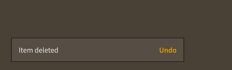
A toast may optionally include one or more action buttons by creating it with Toast.showMessageWithActions(). In the following example, we display a toast with an Undo button:
Toast.showMessageWithActions( "Item deleted", new ArrayCollection(
[
    { label: "Undo", triggered: undoButton_triggeredHandler }
]));
Each item in the colllection may contain its own separate Event.TRIGGERED listener, or you can listen for Event.CLOSE on the Toast instance. If one of the buttons was triggered, the event's data will contain an item from the collection.
toast.addEventListener( Event.CLOSE, function(event:Event, item:Object):void
{
    trace( item.label );
});
Custom content
A toast may be created without a message and actions and use completely custom content instead by calling Toast.showContent(). In the following example, we display a toast that contains an Image:
var image:Image = new Image( texture );
Toast.showContent( image );
Any Starling display object or Feathers component may be used as the content. To include multiple items in the content, you may add them all to a parent LayoutGroup.
Skinning a Toast
A number of styles may be customized on a toast, including the message font styles, the background skin, and layout properties. Additionally, a toast has a button group sub-component that may be styled. For full details about which properties are available, see the Toast API reference. We'll look at a few of the most common ways of styling a toast below.
Font styles
The font styles of the toast's message may be customized using the fontStyles property:
toast.fontStyles = new TextFormat( "Helvetica", 20, 0x3c3c3c );
Pass in a starling.text.TextFormat object, which will work with any type of text renderer.
The font styles of the toast's action buttons may be customized through the toast's ButtonGroup component. See How to use the ButtonGroup component for details.
Background skin
The background skin fills the full width and height of the toast. In the following example, we pass in a starling.display.Image, but the skin may be any Starling display object:
var skin:Image = new Image( enabledTexture );
skin.scale9Grid = new Rectangle( 2, 4, 3, 8 );
toast.backgroundSkin = skin;
It's as simple as setting the backgroundSkin property.
Layout
Padding may be added around the edges of the toast. This padding is applied around the edges of the message text renderer, and is generally used to show a bit of the background as a border.
toast.paddingTop = 15;
toast.paddingRight = 20;
toast.paddingBottom = 15;
toast.paddingLeft = 20;
If all four padding values should be the same, you may use the padding property to quickly set them all at once:
toast.padding = 20;
If the optional action buttons are displayed, you may use the gap property to add some space between the message and the actions:
toast.gap = 12;
Skinning the action buttons
This section only explains how to access the button group sub-component. Please read How to use the ButtonGroup component for full details about the skinning properties that are available on ButtonGroup components.
With a Theme
If you're creating a theme, you can target the Toast.DEFAULT_CHILD_STYLE_NAME_ACTIONS style name.
getStyleProviderForClass( ButtonGroup )
	.setFunctionForStyleName( Toast.DEFAULT_CHILD_STYLE_NAME_ACTIONS, setToastActionsStyles );
The styling function might look like this:
private function setToastActionsStyles( group:ButtonGroup ):void
{
	group.gap = 20;
}
You can override the default style name to use a different one in your theme, if you prefer:
toast.customActionsStyleName = "custom-actions";
You can set the styling function for the customActionsStyleName like this:
getStyleProviderForClass( ButtonGroup )
	.setFunctionForStyleName( "custom-actions", setToastCustomActionsStyles );
Without a Theme
If you are not using a theme, you can use actionsFactory to provide skins for the toast's action buttons group:
toast.actionsFactory = function():Header
{
	var group:ButtonGroup = new ButtonGroup();

	//skin the button group here, if you're not using a theme
	group.gap = 20;

	return group;
}
Using a factory to skin a Toast without a theme
If you're not using a theme, you can specify a factory to create the toast, including setting skins, in a couple of different ways. The first is to set the Toast.toastFactory static property to a function that provides skins for the toast. This factory will be called any time that Toast.showMessage(), Toast.showMessageWithActions(), or Toast.showContent() is used to create a toast.
function skinnedToastFactory():Toast
{
	var toast:Toast = new Toast();
	toast.backgroundSkin = new Image( texture );
	// etc...
	return toast;
};
Toast.toastFactory = skinnedToastFactory;
Another option is to pass a toast factory to Toast.showMessage() or one of the other static methods to create a toast. This allows you to create a specific toast differently than the default global Toast.toastFactory.
function skinnedToastFactory():Toast
{
	var toast:Toast = new Toast();
	toast.backgroundSkin = new Image( texture );
	// etc...
	return toast;
};
Toast.showMessage( message, 4, skinnedToastFactory );
Closing and Disposal
When manually closing the toast, you may call the close() function and pass in true or false for the dispose argument.
It's possible that the toast will close itself automatically. For instance, the timeout property specifies the time, in seconds, that the toast will remain open.
By default, when the toast closes itself, it will also dispose itself. Set the disposeOnSelfClose property to false if you intend to reuse the toast. Simply pass it to Toast.addToast() to reuse it.
Finally, you may want to reuse the toasts's content. By default, the toast will also dispose its content when it is disposed. Set the disposeContent property to false to allow your code to reuse the toast's content in another toast or elsewhere on the display list after the original toast is disposed.