How to use the TextInput component (AS3/Starling version)
The TextInput class supports the editing of text. It displays a background skin and uses a text editor to allow the user to modify the text.
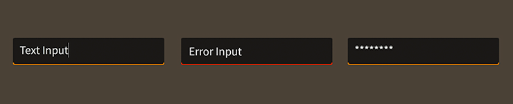
TextInput components skinned with MetalWorksMobileThemeThe Basics
First, let's create a TextInput control and add it to the display list:
var input:TextInput = new TextInput();
this.addChild( input );
Changing text programmatically
Text may be changed programatically by setting the text property:
input.text = "Hello World";
Prompt
A prompt or hint may be displayed to describe the purpose of the text input when the text input does not contain any text.
input.prompt = "Password";
Simply set the prompt property to any String to display it inside the text input.
Focus and Selection
You may programmatically set focus to the text input by calling setFocus():
input.setFocus();
You can select part of the text too:
input.selectRange(0, input.text.length);
If you simply want to set the position of the cursor, you can omit the second argument to selectRange():
input.selectRange(0);
Events
Text inputs provide a number of useful events. One of the most common requirements is knowing, in real time, when the value of the text property has changed:
input.addEventListener( Event.CHANGE, input_changeHandler );
We can listen for Event.CHANGE.
We might also want to know when the user presses Keyboard.ENTER:
input.addEventListener( FeathersEventType.ENTER, input_enterHandler );
Simply listen for FeathersEventType.ENTER.
On some mobile platforms, the
FeathersEventType.ENTERevent may not always be dispatched by certain text editors. For complete details, please refer to the API reference for the specific text editor that you are using.
Finally, you might also want to know when the text input receives and loses focus:
input.addEventListener( FeathersEventType.FOCUS_IN, input_focusInHandler );
input.addEventListener( FeathersEventType.FOCUS_OUT, input_focusOutHandler );
The FeathersEventType.FOCUS_IN and FeathersEventType.FOCUS_OUT events are specially dispatched by the TextInput, even if the focus manager is not enabled.
Customize input behavior
The displayAsPassword property may be enabled to mask a text input's text:
input.displayAsPassword = true;
Set the isEditable property to false to make the text uneditable, without giving the text input a disabled appearance:
input.isEditable = false;
To limit the number of characters that may be entered, use the maxChars property:
input.maxChars = 16;
The restrict property limits the set of characters that can be entered into the text input. It works like the restrict property on flash.text.TextField.
input.restrict = "0-9";
In the example above, we restrict to numeric values only.
Skinning a TextInput
A text input provides a number of properties to customize its appearance. For full details about what skin and style properties are available, see the TextInput API reference. We'll look at a few of the most common ways of styling a text input below.
Font Styles
The text input's font styles may be customized using the fontStyles property.
input.fontStyles = new TextFormat( "Helvetica", 20, 0x3c3c3c );
Pass in a starling.text.TextFormat object, which will work with any type of text editor.
If the input should use different font styles when it is disabled, you may set the disabledFontStyles property too:
input.disabledFontStyles = new TextFormat( "Helvetica", 20, 0x9a9a9a );
Finally, we can even customize the font styles for each of the input's specific states:
input.setFontStylesForState( TextInputState.ERROR,
    new TextFormat( "Helvetica", 20, 0xcc0000 ) );
Using the code above, the color of the input's text will change when the input displays an errorString, and the state changes to TextInputState.ERROR.
When font styles aren't available for a specific state, the input will use the default fontStyles as a fallback. For example, we haven't provided font styles for TextInputState.FOCUSED, so the default styles will be used.
The font styles of the prompt text renderer may be customized separately:
input.promptFontStyles = new TextFormat( "Helvetica", 20, 0x3c3c3c );
input.promptDisabledFontStyles = new TextFormat( "Helvetica", 20, 0x9a9a9a );
input.setPromptFontStylesForState( TextInputState.ERROR,
    new TextFormat( "Helvetica", 20, 0xcc0000 ) );
See the promptFontStyles and promptDisabledFontStyles properties, and the setPromptFontStylesForState() function for details.
Background Skin
Let's give our text input its background skin. In the following example, we'll use an ImageSkin, but the skin may be any Starling display object:
var skin:ImageSkin = new ImageSkin( upTexture );
skin.scale9Grid = new Rectangle( 2, 3, 3, 8 );
input.backgroundSkin = skin;
We can change the appearance of the text input's skin when the state changes. In the next example, we provide another texture to the same ImageSkin for the text input's "focused" state:
skin.setTextureForState( TextInputState.FOCUSED, focusedTexture );
The ImageSkin automatically listens for changes to the text input's state and updates its appearance to match. When the text input is given focus, the ImageSkin will display this texture instead of the default one.
We can also provide different display objects for specific states, if needed. In the next example, we have a texture for the "disabled" state that requires a different scale9Grid than the other textures. We can create a separate ImageSkin for this state:
var disabledSkin:ImageSkin = new ImageSkin( disabledTexture );
input.scale9Grid = new Rectangle( 4, 2, 2, 10 );
input.setSkinForState( TextInputState.DISABLED, disabledSkin );
Pass in skins for any state using the setSkinForState() function.
If a skin is not provided for a specific state, the text area will display its backgroundSkin. Similarly, when using an ImageSkin, and a texture isn't provided for a specific state, it will display its default texture.
Icon
Let's also add an icon to the TextInput. Icons may be customized for each of the text input's states (just like the background skin), but let's simply use one icon. In this example, we'll pass in a starling.display.Image:
input.defaultIcon = new Image( iconTexture );
This icon will be displayed for all of the text input's different states.
If we wanted to change the appearance of the icon when the text input's state changes, we could use a feathers.skins.ImageSkin with multiple textures, like we did in the example above that demonstrated how to set the text input's background skin. Similarly, we could use setIconForState() to pass in different display objects for each state.
Layout
Padding may be added on each side of the text input:
input.paddingTop = 5;
input.paddingRight = 8;
input.paddingBottom = 5;
input.paddingLeft = 8;
If all four padding values should be the same, you may use the padding property to quickly set them all at once:
input.padding = 6;
The typicalText property may be used to help the text input calculate its dimensions based on the dimensions of a specific rendered string:
input.typicalText = "The quick brown fox jumps over the lazy dog";
By default, the text input does not use its text for measurement. Instead, it uses the background skin, padding, and other layout properties. typicalText is useful when there is a width or height that must be based on the font styles. For instance, the NumericStepper component uses this property to provide the text input with a string that represents the largest possible string it might display.