How to use the ButtonGroup component (AS3/Starling version)
The ButtonGroup class displays a set of buttons displayed one after the other in a simple horizontal or vertical layout. It is best used for a set of related buttons that generally look the same and are meant to be displayed together meaningfully. For instance, an alert dialog populates its OK/Cancel/Yes/No/etc. buttons using a ButtonGroup.
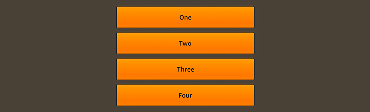
ButtonGroup component skinned with MetalWorksMobileThemeThe Basics
First, let's create a ButtonGroup control and add it to the display list:
var group:ButtonGroup = new ButtonGroup();
this.addChild(group);
This won't display anything because we haven't populated the data provider with information about the buttons we want. Let's do that next:
group.dataProvider = new ArrayCollection(
[
    { label: "One", triggered: oneButton_triggeredHandler },
    { label: "Two", triggered: twoButton_triggeredHandler },
    { label: "Three", triggered: threeButton_triggeredHandler },
]);
Like the List or TabBar components, the ButtonGroup uses an implementation of IListCollection, such as ArrayCollection or VectorCollection, as its data provider.
A number of fields in each item from the collection are automatically detected by the button group. For instance, we set the label on each button above. Each of a button's icon states may also be used here, along with isToggle and isSelected to make them into toggling buttons.
For full details about which properties can be set on tabs, see the description of the
dataProviderproperty.
Additionally, we can add a few event listeners to each button, including Event.TRIGGERED and Event.CHANGE (using the String values, triggered and change). In the example above, we add a listener to triggered. The listener on the first item might look something like this:
function oneButton_triggeredHandler( event:Event ):void
{
    var button:Button = Button( event.currentTarget );
    trace( "button triggered:", button.label );
}
Skinning a ButtonGroup
A button group's buttons may all be skinned, with the first and last buttons having optional custom styles. A few other properties exist to customize the layout. For full details about which properties are available, see the ButtonGroup API reference. We'll look at a few of the most common ways of styling a button group below.
Layout
The ButtonGroup has a strict horizontal or vertical layout that you can customize using the direction property. Additionally, you can set the gap between buttons, including special gaps for the first and last buttons.
group.direction = Direction.VERTICAL;
group.gap = 10;
group.lastGap = 20;
The firstGap and lastGap are completely optional, and if they are not defined, the regular gap value will be used.
With a vertical layout, each button's width will match the width of the button group. Similarly, with a horizontal layout, the buttons will fill the entire height.
Skinning the Buttons
This section only explains how to access the button sub-components. Please read How to use the Button component for full details about the skinning properties that are available on Button components.
With a Theme
If you're creating a theme, you can target the ButtonGroup.DEFAULT_CHILD_STYLE_NAME_BUTTON style name.
getStyleProviderForClass( Button )
    .setFunctionForStyleName( ButtonGroup.DEFAULT_CHILD_STYLE_NAME_BUTTON, setButtonGroupButtonStyles );
The styling function might look like this:
private function setButtonGroupButtonStyles( button:Button ):void
{
    var skin:ImageSkin = new ImageSkin( texture );
    skin.scale9Grid = new Rectangle( 2, 3, 1, 6 );
    button.defaultSkin = skin;
    button.fontStyles = new TextFormat( "Helvetica", 20, 0x3c3c3c );
}
You can override the default style name to use a different one in your theme, if you prefer:
group.customButtonStyleName = "my-custom-button";
You can set the styling function for the customButtonStyleName like this:
getStyleProviderForClass( Button )
    .setFunctionForStyleName( "my-custom-button", setButtonGroupCustomButtonStyles );
Without a Theme
If you are not using a theme, you can use buttonFactory to provide skins for the buttons:
group.buttonFactory = function():Button
{
    var button:Button = new Button();

    //skin the buttons here, if you're not using a theme
    var skin:ImageSkin = new ImageSkin( texture );
    skin.scale9Grid = new Rectangle( 2, 3, 1, 6 );
    button.defaultSkin = skin;
    button.fontStyles = new TextFormat( "Helvetica", 20, 0x3c3c3c );

    return button;
};
Skinning the First and Last Buttons
This section only explains how to access the first and last button sub-components. Please read How to use the Button component for full details about the skinning properties that are available on Button components.
The button group's first and last buttons will have the same skins as the other buttons by default. However, their skins may be customized separately, if desired.
For the first button, you can customize the style name with customFirstButtonStyleName. If you aren't using a theme, then you can use firstButtonFactory.
For the last button, you can customize the style name with customLastButtonStyleName. If you aren't using a theme, then you can use lastButtonFactory.
Separate skins for the first and last buttons are completely optional.