How to use the TextArea component (AS3/Starling version)
The TextArea class supports the editing of multiline, uniformly-formatted text.
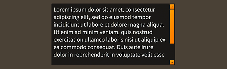
TextArea component skinned with MetalWorksDesktopTheme
TextAreais designed specifically for desktop apps, and it is not recommended for use in mobile touchscreen apps. Instead, on mobile, you should use aTextInputcomponent with aStageTextTextEditorwith itsmultilineproperty set totrue. The underlyingStageTextwill provide its own native scroll bar.
The Basics
First, let's create a TextArea control and add it to the display list:
var textArea:TextArea = new TextArea();
this.addChild( textArea );
Changing text programmatically
Text may be changed programatically by setting the text property:
textArea.text = "Hello\nWorld";
Focus and Selection
You may programmatically set focus to the text area by calling setFocus():
textArea.setFocus();
You can select part of the text too:
textArea.selectRange(0, textArea.text.length);
If you simply want to set the position of the cursor, you can omit the second argument to selectRange():
textArea.selectRange(0);
Events
Text areas provide some useful events. One of the most common requirements is knowing, in real time, when the value of the text property has changed:
textArea.addEventListener( Event.CHANGE, textArea_changeHandler );
We can listen for Event.CHANGE.
You might also want to know when the text area receives and loses focus:
textArea.addEventListener( FeathersEventType.FOCUS_IN, textArea_focusInHandler );
textArea.addEventListener( FeathersEventType.FOCUS_OUT, textArea_focusOutHandler );
The FeathersEventType.FOCUS_IN and FeathersEventType.FOCUS_OUT events are specially dispatched by the TextArea, even if the focus manager is not enabled.
Customize input behavior
Several properties allow you to customize a text area's behavior.
Set the isEditable property to false to make the text uneditable, without giving the text area a disabled appearance:
textArea.isEditable = false;
To limit the number of characters that may be entered, use the maxChars property:
textArea.maxChars = 16;
The restrict property limits the set of characters that can be entered into the text area. It works like the restrict property on flash.text.TextField.
textArea.restrict = "0-9";
In the example above, we restrict to numeric values only.
Skinning a TextArea
A text area provides a number of properties to customize its appearance. For full details about what skin and style properties are available, see the TextArea API reference. We'll look at a few of the most common ways of styling a text area below.
Font Styles
The text area's font styles may be customized using the fontStyles property.
textArea.fontStyles = new TextFormat( "Helvetica", 20, 0x3c3c3c );
Pass in a starling.text.TextFormat object, which will work with any type of text editor.
If the text area should use different font styles when it is disabled, you may set the disabledFontStyles property too:
textArea.disabledFontStyles = new TextFormat( "Helvetica", 20, 0x9a9a9a );
Finally, we can even customize the font styles for each of the text area's specific states:
textArea.setFontStylesForState( TextInputState.ERROR,
    new TextFormat( "Helvetica", 20, 0xcc0000 ) );
Using the code above, the color of the text area's text will change when the text area displays an errorString, and the state changes to TextInputState.ERROR.
When font styles aren't available for a specific state, the text area will use the default fontStyles as a fallback. For example, we haven't provided font styles for TextInputState.FOCUSED, so the default styles will be used.
Background Skin
Let's give our text area its background skin. In the following example, we'll use an ImageSkin, but the skin may be any Starling display object:
var skin:ImageSkin = new ImageSkin( upTexture );
skin.scale9Grid = new Rectangle( 2, 3, 3, 8 );
textArea.backgroundSkin = skin;
We can change the appearance of the text area's skin when the state changes. In the next example, we provide another texture to the same ImageSkin for the text area's "focused" state:
skin.setTextureForState( TextInputState.FOCUSED, focusedTexture );
The ImageSkin automatically listens for changes to the text area's state and updates its appearance to match. When the text area is given focus, the ImageSkin will display this texture instead of the default one.
We can also provide different display objects for specific states, if needed. In the next example, we have a texture for the "disabled" state that requires a different scale9Grid than the other textures. We can create a separate ImageSkin for this state:
var disabledSkin:ImageSkin = new ImageSkin( disabledTexture );
textArea.scale9Grid = new Rectangle( 4, 2, 2, 10 );
textArea.setSkinForState( TextInputState.DISABLED, disabledSkin );
Pass in skins for any state using the setSkinForState() function.
If a skin is not provided for a specific state, the text area will display its backgroundSkin. Similarly, when using an ImageSkin, and a texture isn't provided for a specific state, it will display its default texture.
Layout
Padding may be added on each side of the text area:
textArea.paddingTop = 5;
textArea.paddingRight = 8;
textArea.paddingBottom = 5;
textArea.paddingLeft = 8;
If all four padding values should be the same, you may use the padding property to quickly set them all at once:
textArea.padding = 6;
Skinning the Scroll Bars
This section only explains how to access the horizontal scroll bar and vertical scroll bar sub-components. Please read How to use the ScrollBar component (or SimpleScrollBar) for full details about the skinning properties that are available on scroll bar components.
With a Theme
If you're creating a theme, you can target the Scroller.DEFAULT_CHILD_STYLE_NAME_HORIZONTAL_SCROLL_BAR style name for the horizontal scroll bar and the Scroller.DEFAULT_CHILD_STYLE_NAME_VERTICAL_SCROLL_BAR style name for the vertical scroll bar.
getStyleProviderForClass( ScrollBar )
    .setFunctionForStyleName( Scroller.DEFAULT_CHILD_STYLE_NAME_HORIZONTAL_SCROLL_BAR, setHorizontalScrollBarStyles );
getStyleProviderForClass( ScrollBar )
    .setFunctionForStyleName( Scroller.DEFAULT_CHILD_STYLE_NAME_VERTICAL_SCROLL_BAR, setVerticalScrollBarStyles );
The styling function for the horizontal scroll bar might look like this:
private function setHorizontalScrollBarStyles(scrollBar:ScrollBar):void
{
    scrollBar.trackLayoutMode = TrackLayoutMode.SINGLE;
}
You can override the default style names to use different ones in your theme, if you prefer:
textArea.customHorizontalScrollBarStyleName = "custom-horizontal-scroll-bar";
textArea.customVerticalScrollBarStyleName = "custom-vertical-scroll-bar";
You can set the funciton for the customHorizontalScrollBarStyleName and the customVerticalScrollBarStyleName like this:
getStyleProviderForClass( ScrollBar )
    .setFunctionForStyleName( "custom-horizontal-scroll-bar", setCustomHorizontalScrollBarStyles );
getStyleProviderForClass( ScrollBar )
    .setFunctionForStyleName( "custom-vertical-scroll-bar", setCustomVerticalScrollBarStyles );
Without a Theme
If you are not using a theme, you can use horizontalScrollBarFactory and verticalScrollBarFactory to provide skins for the text area's scroll bars:
textArea.horizontalScrollBarFactory = function():ScrollBar
{
    var scrollBar:ScrollBar = new ScrollBar();

    //skin the scroll bar here, if not using a theme
    scrollBar.trackLayoutMode = TrackLayoutMode.SINGLE;

    return scrollBar;
}
Customize scrolling behavior
A number of properties are available to customize scrolling behavior and the scroll bars.
Interaction Modes
Scrolling containers provide two main interaction modes, which can be changed using the interactionMode property.
By default, you can scroll using touch, just like you would on many mobile devices including smartphones and tablets. This mode allows you to grab the container anywhere within its bounds and drag it around to scroll. This mode is defined by the constant, ScrollInteractionMode.TOUCH.
Alternatively, you can set interactionMode to ScrollInteractionMode.MOUSE. This mode allows you to scroll using the horizontal or vertical scroll bar sub-components. You can also use the mouse wheel to scroll vertically.
Finally, you can set interactionMode to ScrollInteractionMode.TOUCH_AND_SCROLL_BARS. This mode allows you to scroll both by dragging the container's content and by using the scroll bars.
Scroll Bar Display Mode
The scrollBarDisplayMode property controls how and when scroll bars are displayed. This value may be overridden by the scroll policy, as explained below.
The default value is ScrollBarDisplayMode.FLOAT, which displays the scroll bars as an overlay above the view port's content, rather than affecting the size of the view port. When the scroll bars are floating, they fade out when the container is not actively scrolling. This is a familiar behavior for scroll bars in the touch interaction mode. In the mouse interaction mode, the scroll bars will appear when the mouse hovers over them and then disappear when the hover ends.
To completely hide the scroll bars, but still allow scrolling, you can set scrollBarDisplayMode to ScrollBarDisplayMode.NONE.
If you want the scroll bars to always be visible outside of the content in a fixed position, you can set scrollBarDisplayMode to ScrollBarDisplayMode.FIXED. This is best for traditional desktop scrollable content.
Finally, you can set scrollBarDisplayMode to ScrollBarDisplayMode.FIXED_FLOAT to display the scroll bar as an overlay above the view port's content, but it does not fade away.
Scroll Policies
The two previous properties control how scrolling works. The horizontalScrollPolicy and verticalScrollPolicy properties control whether scrolling is enabled or not.
The default scroll policy for both directions is ScrollPolicy.AUTO. If the content's width is greater than the view port's width, the text area may scroll horizontally (same for height and vertical scrolling). If not, then the text area will not scroll in that direction. In addition to the scrollBarDisplayMode, this can affect whether the scroll bar is visible or not.
You can completely disable scrolling in either direction, set the scroll policy to ScrollPolicy.OFF. The scroll bar will not be visible, and the text area won't scroll, even if the content is larger than the view port.
Finally, you can ensure that scrolling is always enabled by setting the scroll policy to ScrollPolicy.ON. If combined with hasElasticEdges in the touch interaction mode, it will create a playful edge that always bounces back, even when the content is smaller than the view port. If using the mouse interaction mode, the scroll bar may always be visible under the same circumstances, though it may be disabled if the content is smaller than the view port.