How to use the ScrollText component (AS3/Starling version)
The ScrollText is designed for displaying long passages of scrolling text. With longer text, TextBlockTextRenderer or TextFieldTextRenderer may use too much memory with the textures that they require. BitmapFontTextRenderer may be a good alternative, but with enough characters, it may begin to affect performance too. ScrollText provides a potential workaround by displaying text on the classic display list as an overlay above Starling.
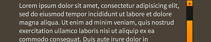
ScrollText component skinned with MetalWorksDesktopThemeA disadvantage of displaying text on the classic display list is that the text will always appear above Stage 3D content, including regular Starling display objects. There is no way to overlay Starling content above
ScrollText.
The Basics
First, let's create a ScrollText component, give it some text to display, and add it to the display list.
var scrollText:ScrollText = new ScrollText();
scrollText.text = "Lorem ipsum dolor sit amet, consectetur adipisicing elit, sed do eiusmod tempor incididunt ut labore et dolore magna aliqua. Ut enim ad minim veniam, quis nostrud exercitation ullamco laboris nisi ut aliquip ex ea commodo consequat. Duis aute irure dolor in reprehenderit in voluptate velit esse cillum dolore eu fugiat nulla pariatur. Excepteur sint occaecat cupidatat non proident, sunt in culpa qui officia deserunt mollit anim id est laborum.";
this.addChild( scrollText );
As you can see, the ScrollText is added to the Starling display list. This is merely an abstraction. Behind the scenes, a flash.text.TextField is created and added to the classic display list. As you move and scale the ScrollText instance on the Starling display list, the TextField will be manipulated on the classic display list.
If we set the width property, the ScrollText content will automatically word wrap, and the height will grow.
scrollText.width = 200;
If we set both the width and height properties, the ScrollText content will automatically allow scrolling if the content is taller than the height of the ScrollText.
scrollText.width = 200;
scrollText.height = 200;
Skinning a ScrollText
For full details about what skin and style properties are available, see the ScrollText API reference. We'll look at a few of the most common ways of styling a ScrollText below.
Font styles
The font styles of the ScrollText may be customized using the fontStyles property.
scrollText.fontStyles = new TextFormat( "Helvetica", 20, 0x3c3c3c );
Pass in a starling.text.TextFormat object, the same as you would for a text renderer.
If the ScrollText should use different font styles when it is disabled, you may set the disabledFontStyles property too:
scrollText.disabledFontStyles = new TextFormat( "Helvetica", 20, 0x9a9a9a );
Simple HTML
Use the isHTML property to display the text as HTML, with the same capabilities as the htmlText property of flash.text.TextField.
scrollText.isHTML = true;
scrollText.text = "<font color=\"#ff0000\">Hello world</font>";
A number of other styling properties from flash.text.TextField are available to use with ScrollText, including antiAliasType, backgroundColor, borderColor, gridFitType, styleSheet, sharpness, thickness, and others. See the ScrollText API documentation for full details.
Skinning the Scroll Bars
This section only explains how to access the horizontal scroll bar and vertical scroll bar sub-components. Please read How to use the ScrollBar component (or SimpleScrollBar) for full details about the skinning properties that are available on scroll bar components.
With a Theme
If you're creating a theme, you can target the Scroller.DEFAULT_CHILD_STYLE_NAME_HORIZONTAL_SCROLL_BAR style name for the horizontal scroll bar and the Scroller.DEFAULT_CHILD_STYLE_NAME_VERTICAL_SCROLL_BAR style name for the vertical scroll bar.
getStyleProviderForClass( ScrollBar )
    .setFunctionForStyleName( Scroller.DEFAULT_CHILD_STYLE_NAME_HORIZONTAL_SCROLL_BAR, setHorizontalScrollBarStyles );
getStyleProviderForClass( ScrollBar )
    .setFunctionForStyleName( Scroller.DEFAULT_CHILD_STYLE_NAME_VERTICAL_SCROLL_BAR, setVerticalScrollBarStyles );
The styling function for the horizontal scroll bar might look like this:
private function setHorizontalScrollBarStyles(scrollBar:ScrollBar):void
{
    scrollBar.trackLayoutMode = TrackLayoutMode.SINGLE;
}
You can override the default style names to use different ones in your theme, if you prefer:
scrollText.customHorizontalScrollBarStyleName = "custom-horizontal-scroll-bar";
scrollText.customVerticalScrollBarStyleName = "custom-vertical-scroll-bar";
You can set the function for the customHorizontalScrollBarStyleName and the customVerticalScrollBarStyleName like this:
getStyleProviderForClass( ScrollBar )
    .setFunctionForStyleName( "custom-horizontal-scroll-bar", setCustomHorizontalScrollBarStyles,  );
getStyleProviderForClass( ScrollBar )
    .setFunctionForStyleName( "custom-vertical-scroll-bar", setCustomVerticalScrollBarStyles );
Without a Theme
If you are not using a theme, you can use horizontalScrollBarFactory and verticalScrollBarFactory to provide skins for the scroll bars:
scrollText.horizontalScrollBarFactory = function():ScrollBar
{
    var scrollBar:ScrollBar = new ScrollBar();

    //skin the scroll bar here, if not using a theme
    scrollBar.trackLayoutMode = TrackLayoutMode.SINGLE;

    return scrollBar;
}
Customize scrolling behavior
A number of properties are available to customize scrolling behavior and the scroll bars.
Interaction Modes
Scrolling containers provide two main interaction modes, which can be changed using the interactionMode property.
By default, you can scroll using touch, just like you would on many mobile devices including smartphones and tablets. This mode allows you to grab the container anywhere within its bounds and drag it around to scroll. This mode is defined by the constant, ScrollInteractionMode.TOUCH.
Alternatively, you can set interactionMode to ScrollInteractionMode.MOUSE. This mode allows you to scroll using the horizontal or vertical scroll bar sub-components. You can also use the mouse wheel to scroll vertically.
Finally, you can set interactionMode to ScrollInteractionMode.TOUCH_AND_SCROLL_BARS. This mode allows you to scroll both by dragging the container's content and by using the scroll bars.
Scroll Bar Display Mode
The scrollBarDisplayMode property controls how and when scroll bars are displayed. This value may be overridden by the scroll policy, as explained below.
The default value is ScrollBarDisplayMode.FLOAT, which displays the scroll bars as an overlay above the view port's content, rather than affecting the size of the view port. When the scroll bars are floating, they fade out when the container is not actively scrolling. This is a familiar behavior for scroll bars in the touch interaction mode. In the mouse interaction mode, the scroll bars will appear when the mouse hovers over them and then disappear when the hover ends.
To completely hide the scroll bars, but still allow scrolling, you can set scrollBarDisplayMode to ScrollBarDisplayMode.NONE.
If you want the scroll bars to always be visible outside of the content in a fixed position, you can set scrollBarDisplayMode to ScrollBarDisplayMode.FIXED. This is best for traditional desktop scrollable content.
Finally, you can set scrollBarDisplayMode to ScrollBarDisplayMode.FIXED_FLOAT to display the scroll bar as an overlay above the view port's content, but it does not fade away.
Scroll Policies
The two previous properties control how scrolling works. The horizontalScrollPolicy and verticalScrollPolicy properties control whether scrolling is enabled or not.
The default scroll policy for both directions is ScrollPolicy.AUTO. If the content's width is greater than the view port's width, the text may scroll horizontally (same for height and vertical scrolling). If not, then the text will not scroll in that direction. In addition to the scrollBarDisplayMode, this can affect whether the scroll bar is visible or not.
You can completely disable scrolling in either direction, set the scroll policy to ScrollPolicy.OFF. The scroll bar will not be visible, and the text won't scroll, even if the content is larger than the view port.
Finally, you can ensure that scrolling is always enabled by setting the scroll policy to ScrollPolicy.ON. If combined with hasElasticEdges in the touch interaction mode, it will create a playful edge that always bounces back, even when the content is smaller than the view port. If using the mouse interaction mode, the scroll bar may always be visible under the same circumstances, though it may be disabled if the content is smaller than the view port.