How to use the ScrollBar component (AS3/Starling version)
The ScrollBar component selects a numeric value in a specific range by dragging a thumb along a track, or by triggering one of its step buttons at the beginning or end of the track. A scroll bar may be displayed in either a horizontal or a vertical direction. This component is designed to be used with components that support scrolling, like ScrollContainer and List.
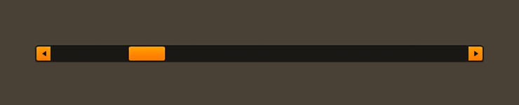
ScrollBar component skinned with MetalWorksDesktopThemeAdditionally, Feathers offers a
SimpleScrollBarcomponent. This is a mobile-style scroll bar that only has a thumb to visually indicate the scroll position and range. It has no visible track nor buttons for stepping the scroll position.
The Basics
You can use the ScrollBar with a class like ScrollContainer or List by instantiating it in the horizontalScrollBarFactory or the verticalScrollBarFactory.
list.horizontalScrollBarFactory = function():IScrollBar
{
    return new ScrollBar();
}
The container will automatically handle setting properties like direction, minimum, maximum, and step, and it will automatically listen for Event.CHANGE to know when the value property changes.
If, for some reason, you want to use a
ScrollBaroutside of a container, the values likeminimum,maximum,stepandvaluethat are normally handled by the container work similarly to the same properties on aSlidercomponent.
Skinning a ScrollBar
The skins for a ScrollBar control are divided into several parts, including the thumb, the track(s), and the increment and decrement buttons. For full details about what skin and style properties are available, see the ScrollBar API reference.
Track(s) and Layout
The scroll bar's track is made from either one or two buttons, depending on the value of the trackLayoutMode property. The default value of this property is TrackLayoutMode.SINGLE, which creates a single track that fills the entire width and height of the scroll bar.
If we'd like to have separate buttons for both sides of the track (one for the minimum side and another for the maximum side), we can set trackLayoutMode to TrackLayoutMode.SPLIT. In this mode, the width or height of each track (depending on the direction of the scroll bar) is adjusted as the thumb moves to ensure that the two tracks always meet at the center of the thumb.
TrackLayoutMode.SINGLE is often best for cases where the track's appearance is mostly static. When you want down or hover states for the track, TrackLayoutMode.SPLIT works better because the state will only change on one side of the thumb, making it more visually clear to the user what is happening.
When the value of trackLayoutMode is TrackLayoutMode.SINGLE, the scroll bar will have a minimum track, but it will not have a maximum track. The minimum track will fill the entire region that is scrollable.
Skinning the Thumb
This section only explains how to access the thumb sub-component. Please read How to use the Button component for full details about the skinning properties that are available on Button components.
With a Theme
If you're creating a theme, you can target the ScrollBar.DEFAULT_CHILD_STYLE_NAME_THUMB style name.
getStyleProviderForClass( Button )
    .setFunctionForStyleName( ScrollBar.DEFAULT_CHILD_STYLE_NAME_THUMB, setScrollBarThumbStyles );
The styling function might look like this:
private function setScrollBarThumbStyles( thumb:Button ):void
{
    var skin:ImageSkin = new ImageSkin( texture );
    skin.scale9Grid = new Rectangle( 2, 3, 1, 6 );
    thumb.defaultSkin = skin;
}
You can override the default style name to use a different one in your theme, if you prefer:
scrollBar.customThumbStyleName = "custom-thumb";
You can set the function for the customThumbStyleName like this:
getStyleProviderForClass( Button )
    .setFunctionForStyleName( "custom-thumb", setScrollBarCustomThumbStyles );
Without a Theme
If you are not using a theme, you can use thumbFactory to provide skins for the scroll bar's thumb:
scrollBar.thumbFactory = function():Button
{
    var thumb:Button = new Button();

    //skin the thumb here, if not using a theme
    var skin:ImageSkin = new ImageSkin( texture );
    skin.scale9Grid = new Rectangle( 2, 3, 1, 6 );
    thumb.defaultSkin = skin;

    return thumb;
}
Skinning the Minimum Track
This section only explains how to access the minimum track sub-component. Please read How to use the Button component for full details about the skinning properties that are available on Button components.
With a Theme
If you're creating a theme, you can target the ScrollBar.DEFAULT_CHILD_STYLE_NAME_MINIMUM_TRACK style name.
getStyleProviderForClass( Button )
    .setFunctionForStyleName( ScrollBar.DEFAULT_CHILD_STYLE_NAME_MINIMUM_TRACK, setScrollBarMinimumTrackStyles );
The styling function might look like this:
private function setScrollBarMinimumTrackStyles( track:Button ):void
{
    var skin:ImageSkin = new ImageSkin( texture );
    skin.scale9Grid = new Rectangle( 2, 3, 1, 6 );
    track.defaultSkin = skin;
}
You can override the default style name to use a different one in your theme, if you prefer:
scrollBar.customMinimumTrackStyleName = "custom-minimum-track";
You can set the function for the customMinimumTrackStyleName like this:
getStyleProviderForClass( Button )
    .setFunctionForStyleName( "custom-minimum-track", setScrollBarCustomMinimumTrackStyles );
Without a Theme
If you are not using a theme, you can use minimumTrackFactory to provide skins for the scroll bar's minimum track:
scrollBar.minimumTrackFactory = function():Button
{
    var track:Button = new Button();

    //skin the minimum track here, if not using a theme
    var skin:ImageSkin = new ImageSkin( texture );
    skin.scale9Grid = new Rectangle( 2, 3, 1, 6 );
    track.defaultSkin = skin;

    return track;
}
Skinning the Maximum Track
This section only explains how to access the maximum track sub-component. Please read How to use the Button component for full details about the skinning properties that are available on Button components.
The scroll bar's maximum track may be skinned similarly to the minimum track. The style name to use with themes is ScrollBar.DEFAULT_CHILD_STYLE_NAME_MAXIMUM_TRACK or you can customize the style name with customMaximumTrackStyleName. If you aren't using a theme, then you can use maximumTrackFactory.
Skinning the Decrement Button
This section only explains how to access the decrement button sub-component. Please read How to use the Button component for full details about the skinning properties that are available on Button components.
With a Theme
If you're creating a theme, you can target the ScrollBar.DEFAULT_CHILD_STYLE_NAME_DECREMENT_BUTTON style name.
getStyleProviderForClass( Button )
    .setFunctionForStyleName( ScrollBar.DEFAULT_CHILD_STYLE_NAME_DECREMENT_BUTTON, setScrollBarDecrementButtonStyles );
The styling function might look like this:
private function setScrollBarDecrementButtonStyles( button:Button ):void
{
    var skin:ImageSkin = new ImageSkin( texture );
    skin.scale9Grid = new Rectangle( 2, 3, 1, 6 );
    button.defaultSkin = skin;
}
You can override the default style name to use a different one in your theme, if you prefer:
scrollBar.customDecrementButtonStyleName = "custom-decrement-button";
You can set the function for the customDecrementButtonStyleName like this:
getStyleProviderForClass( Button )
    .setFunctionForStyleName( "custom-decrement-button", setScrollBarCustomDecrementButtonStyles );
Without a Theme
If you are not using a theme, you can use decrementButtonFactory to provide skins for the scroll bar's decrement button:
scrollBar.decrementButtonFactory = function():Button
{
    var button:Button = new Button();

    //skin the decrement button here, if not using a theme
    var skin:ImageSkin = new ImageSkin( texture );
    skin.scale9Grid = new Rectangle( 2, 3, 1, 6 );
    button.defaultSkin = skin;

    return button;
}
Skinning the Increment Button
This section only explains how to access the increment button sub-component. Please read How to use the Button component for full details about the skinning properties that are available on Button components.
The scroll bar's increment button may be skinned similarly to the decrement button. The style name to use with themes is ScrollBar.DEFAULT_CHILD_STYLE_NAME_INCREMENT_BUTTON or you can customize the style name with customIncrementButtonStyleName. If you aren't using a theme, then you can use incrementButtonFactory.