Using FlowLayout in Feathers containers (AS3/Starling version)
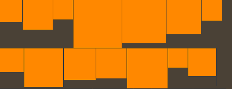
The FlowLayout class may be used by components that support layout, such as List, LayoutGroup and ScrollContainer, to display items from left to right in multiple rows. It supports paging horizontally or vertically, and a number of useful options for the spacing and alignment may be modified.

The Basics
Let's create a flow layout and add it to a LayoutGroup:
var layout:FlowLayout = new FlowLayout();

var container:LayoutGroup = new LayoutGroup();
container.layout = layout;
this.addChild( container );
There are a number of simple properties that may be used to affect positioning and sizing of items in the layout. Let's look at some of the most common.
Spacing
The padding is the space around the edges of the container. Let's set the padding property to 12 pixels:
layout.padding = 12;
If needed, the padding on each side of the container may be set separately. Below, we set the paddingTop and paddingBottom to 10 pixels, and we set the paddingLeft and paddingRight to 15 pixels:
layout.paddingTop = 10;
layout.paddingRight = 15;
layout.paddingBottom = 10;
layout.paddingLeft = 15;
The gap is the space between items, both horizontally or vertically. Let's set the gap property to 5 pixels:
layout.gap = 5;
If needed, the horizontal and vertical gaps may be set separately. We'll set the horizontalGap property to 4 pixels and the verticalGap property to 6 pixels:
layout.horizontalGap = 4;
layout.verticalGap = 6;
Alignment
We can align the items in the layout using the horizontalLayout and verticalLayout properties. Vertical alignment will only apply when the total height of the content (including padding and gap values) is less than or equal to the height of the container that uses the layout. Let's adjust the alignments so that the content will be aligned to the top left:
layout.horizontalAlign = HorizontalAlign.LEFT;
layout.verticalAlign = VerticalAlign.TOP;
Since items may be smaller than the height of a row, we can align items within their rows separately from the alignment of the complete content. We'll align the items vertically in the middle of their rows:
layout.rowVerticalAlign = VerticalAlign.MIDDLE;
Virtual Flow Layout
In a List, Tree, or GroupedList, the layout may be virtualized, meaning that some items in the layout will not actually exist if they are not visible. This helps to improve performance of a scrolling list because only a limited number of item renderers will be created at any given moment. If the list's data provider is very large, a virtual layout is essential, even on desktop computers that have incredible processing power compared to mobile devices.
A virtualized layout will need as estimate about how big a "virtual" item renderer should be. We should set the typicalItem property of the list to have it determine the typical width and height of an item renderer to use as this estimated value. If we don't pass in a typical item, the first item in the data provider is used for this estimate.
By default useVirtualLayout is true for containers that support it. We can disable virtual layouts by setting it to false. When a layout is not virtualized, every single item renderer must be created by the component. If a list has thousands of items, this means that thousands of item renderers need to be created. This can lead to significant performance issues, especially on mobile. In general, useVirtualLayout should rarely be disabled.
layout.useVirtualLayout = false;
The LayoutGroup and ScrollContainer components never use virtual layouts.