How to use the Button component (AS3/Starling version)
The Button class displays a button that may be triggered by pressing and releasing. It can display an optional label and an optional icon with a variety of layout options. Buttons have separate states for each of the different touch phases. The skin and icon can be customized for each state, and the label text renderer may display different font styles for each state too.
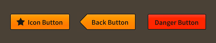
Button components skinned with MetalWorksMobileThemeThe Basics
First, let's create a Button control, give it a label, and add it to the display list:
var button:Button = new Button();
button.label = "Click Me";
this.addChild( button );
If we want to know when the button is tapped or clicked, we can listen for Event.TRIGGERED:
button.addEventListener( Event.TRIGGERED, button_triggeredHandler );
This event is dispatched when the touch ends and the touch was not dragged outside of the button's bounds. In other words, the button is only triggered when the touch both begins and ends over the button.
The listener function might look like this:
function button_triggeredHandler( event:Event ):void
{
    trace( "button triggered" );
}
Button states
When the user interacts with a button, it's internal state changes. This may be used for skinning purposes, such as displaying different background skins or changing font styles. We'll look at some examples in a moment.
All buttons have the following states:
ButtonState.UPis the button's default state when the user is not interacting with it.ButtonState.DOWNis the state when the user presses the button by touching it or clicking it with the mouse.ButtonState.HOVERis the state when the mouse is hovering over the button. On a touchscreen, this state is not used.ButtonState.DISABLEDis the state when the button'sisEnabledproperty has been set tofalse.
Skinning a Button
A number of styles may be customized on a button, including the font styles, the background skin, and an optional icon. For full details about which properties are available, see the Button API reference. We'll look at a few of the most common ways of styling a button below.
Font styles
The font styles of the button's label text renderer may be customized using the fontStyles property.
button.fontStyles = new TextFormat( "Helvetica", 20, 0x3c3c3c );
Pass in a starling.text.TextFormat object, which will work with any type of text renderer.
If the button's label should use different font styles when the button is disabled, you may set the disabledFontStyles property too:
button.disabledFontStyles = new TextFormat( "Helvetica", 20, 0x9a9a9a );
Finally, we can even customize the font styles for each of the button's specific states:
button.setFontStylesForState( ButtonState.DOWN,
	new TextFormat( "Helvetica", 20, 0xcc0000 ) );
Using the code above, the color of the button's label will change when the button is pressed, and the state changes to ButtonState.DOWN.
When font styles aren't available for a specific state, the button will use the default fontStyles as a fallback. For example, we haven't provided font styles for ButtonState.HOVER, so the default styles will be used.
Background skins
Let's give our button its background skin. In the following example, we'll use an ImageSkin, but the skin may be any Starling display object:
var skin:ImageSkin = new ImageSkin( upTexture );
skin.scale9Grid = new Rectangle( 2, 3, 3, 8 );
button.defaultSkin = skin;
We can change the appearance of the button's skin when the state changes. In the next example, we provide another texture to the same ImageSkin for the button's "down" state:
skin.setTextureForState( ButtonState.DOWN, downTexture );
The ImageSkin automatically listens for changes to the button's state and updates its appearance to match. When the user presses the button down, the ImageSkin will display this texture instead of the default one.
We can also provide different display objects for specific states, if needed. In the next example, we have a texture for the "disabled" state that requires a different scale9Grid than the other textures. We can create a separate ImageSkin for this state:
var disabledSkin:ImageSkin = new ImageSkin( disabledTexture );
disabledSkin.scale9Grid = new Rectangle( 4, 2, 2, 10 );
button.setSkinForState( ButtonState.DISABLED, disabledSkin );
Pass in skins for any state using the setSkinForState() function.
If a skin is not provided for a specific state, the button will display its defaultSkin. Similarly, when using an ImageSkin, and a texture isn't provided for a specific state, it will display its default texture.
Icons
Let's also add an icon to the Button. Icons may be customized for each of the button's states (just like the background skin), but let's simply use one icon. In this example, we'll pass in a starling.display.Image:
button.defaultIcon = new Image( iconTexture );
This icon will be displayed for all of the button's different states.
If we wanted to change the appearance of the icon when the button's state changes, we could use a feathers.skins.ImageSkin with multiple textures, like we did in the example above that demonstrated how to set the button's background skin. Similarly, we could use setIconForState() to pass in different display objects for each state.
Layout
Padding may be added on each side of the button:
button.paddingTop = 5;
button.paddingRight = 8;
button.paddingBottom = 5;
button.paddingLeft = 8;
If all four padding values should be the same, you may use the padding property to quickly set them all at once:
button.padding = 6;
The icon may be positioned on any side of the button's label. Let's move the icon above the label so that they are stacked vertically:
button.iconPosition = RelativePosition.TOP;
We set the iconPosition property to RelativePosition.TOP. We can easily position the icon to the top, right, bottom, or left of the label.
The gap refers to the space, measured in pixels, between the icon and the label:
button.gap = 10;
The horizontalAlign and verticalAlign properties will adjust the alignment of the icon and label inside the button, allowing you to anchor them at the edges or in the center.
button.horizontalAlign = HorizontalAlign.CENTER;
button.verticalAlign = VerticalAlign.MIDDLE;