How to use the TabBar component (AS3/Starling version)
The TabBar class displays a set of togglable buttons with a vertical or horizontal layout, where only one button at a time may be selected. A tab bar's tabs may be added or removed at runtime through its data provider, and the first and last tabs may be optionally styled differently. For instance, one could create a more "pill" shaped control that looks more like a segmented button bar than a set of tabs.
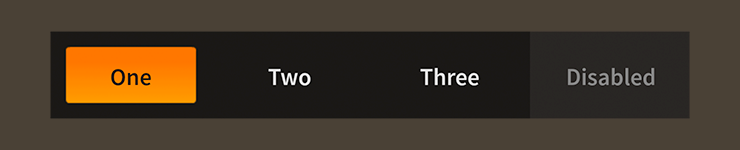
TabBar component skinned with MetalWorksMobileThemeThe Basics
First, let's create a TabBar control, set its data provider to display a few tabs, and add it to the display list:
var tabs:TabBar = new TabBar();
tabs.dataProvider = new ArrayCollection(
[
    { label: "One" },
    { label: "Two" },
    { label: "Three" },
]);
this.addChild( tabs );
The label field in each item from the data provider will set the label property on the corresponding tab. In addition to the label, you can also provide an icon for a tab by setting the defaultIcon field, which gets passed to the tab's defaultIcon property.
For full details about which properties can be set on tabs, see the description of the
dataProviderproperty.
To know when the selected tab changes, we need to listen to Event.CHANGE:
tabs.addEventListener( Event.CHANGE, tabs_changeHandler );
A listener might look something like this:
function tabs_changeHandler( event:Event ):void
{
    var tabs:TabBar = TabBar( event.currentTarget );
    trace( "selectedIndex:", tabs.selectedIndex );
}
The selectedIndex property indicates the zero-based index of the currently selected tab.
Skinning a TabBar
Except for a couple of layout properties, most of the skinning happens on the tabs. For full details about what skin and style properties are available, see the TabBar API reference. We'll look at a few of the most common ways of styling a tab bar below.
Layout
For layout, you can set the direction property to Direction.HORIZONTAL or Direction.VERTICAL.
The gap property sets the extra space, measured in pixels, between tabs. You can also use the firstGap property to provide a different gap after the first tab, and the lastGap property to provide a different gap before the last tab.
The distributeTabSizes property controls whether the combined size of tabs fill the entire length of the TabBar or if they use the minimum space required.
Skinning the Tabs
This section only explains how to access the tab sub-components, which are simply toggle buttons. Please read How to use the ToggleButton component for full details about the skinning properties that are available on ToggleButton components.
With a Theme
If you're creating a theme, you can target the TabBar.DEFAULT_CHILD_STYLE_NAME_TAB style name.
getStyleProviderForClass( ToggleButton )
    .setFunctionForStyleName( TabBar.DEFAULT_CHILD_STYLE_NAME_TAB, setTabStyles );
The styling function might look like this:
private function setTabStyles( tab:ToggleButton ):void
{
    var skin:ImageSkin = new ImageSkin( texture );
    skin.scale9Grid = new Rectangle( 2, 3, 1, 6 );
    tab.defaultSkin = skin;
    tab.fontStyles = new TextFormat( "Helvetica", 20, 0x3c3c3c );
}
You can override the default style name to use a different one in your theme, if you prefer:
tabBar.customTabStyleName = "custom-tab";
You can set the function for the customTabStyleName like this:
getStyleProviderForClass( ToggleButton )
    .setFunctionForStyleName( "custom-tab", setCustomTabStyles );
Without a Theme
If you are not using a theme, you can use tabFactory to provide skins for the tabs:
tabBar.tabFactory = function():ToggleButton
{
    var tab:ToggleButton = new ToggleButton();

    //skin the tab here, if not using a theme
    var skin:ImageSkin = new ImageSkin( texture );
    skin.scale9Grid = new Rectangle( 2, 3, 1, 6 );
    tab.defaultSkin = skin;
    tab.fontStyles = new TextFormat( "Helvetica", 20, 0x3c3c3c );

    return tab;
};
Skinning the First and Last Tabs
This section only explains how to access the first and last tab sub-components. Please read How to use the ToggleButton component for full details about the skinning properties that are available on ToggleButton components.
The tab bar's first and last tabs will have the same skins as the other tabs by default. However, their skins may be customized separately, if desired.
For the first tab, you can customize the name with customFirstTabStyleName. If you aren't using a theme, then you can use firstTabFactory.
For the last tab, you can customize the name with customLastTabStyleName. If you aren't using a theme, then you can use lastTabFactory.
Separate skins for the first and last tabs are completely optional.