Getting started with MXML in the Feathers SDK (legacy AS3/Starling version)
In the following beginner-level tutorial, we'll create our first Feathers SDK application that includes a simple Button component. We'll set some properties, listen for an event, and skin the button with a theme.
Prerequisites
Download the Feathers SDK, and set it up in your favorite development environment.
Add
MetalWorksMobileTheme.swc, included with the Feathers SDK, to your project's build settings. You can find this SWC inside the Feathers SDK. Look forframeworks/themes/MetalWorksMobileTheme/MetalWorksMobileTheme.swc.
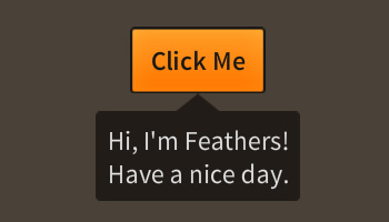
Final Result
Walkthrough
Let's create a new project. The main MXML class will be based on the feathers.core.Application component. We'll start with the following code:
<f:Application xmlns:fx="http://ns.adobe.com/mxml/2009"
    xmlns:f="library://ns.feathersui.com/mxml">
</f:Application>
The Feathers namespace must be included in your MXML document to add Feathers components. This identifier for this namespace is library://ns.feathersui.com/mxml. To reference a Feathers component, you must use the f: prefix before the name of the class. We're using the Application component, so the XML element should be <f:Application/>.
Theme
Next, we want to provide some skins for our components with a theme. By default, the Feathers components are not skinned. However, several example themes are included with Feathers to easily provide sample skins to all components. A theme can be instantiated by setting the theme property on the Application.
<f:Application xmlns:fx="http://ns.adobe.com/mxml/2009"
    xmlns:f="library://ns.feathersui.com/mxml"
    theme="feathers.themes.MetalWorksMobileTheme">
</f:Application>
When a new component initializes, the theme will create appropriate skins, including backgrounds, icons, text formats, and skins for sub-components, and pass them in to each component automatically.
In the Prerequisites section above, we added
MetalWorksMobileTheme.swcto our project. If the compiler gives us errors because it cannot findMetalWorksMobileTheme, we may have forgotten to add this SWC file.
Create a Button component
Let's add a Button as a child of the Application:
<f:Application xmlns:fx="http://ns.adobe.com/mxml/2009"
    xmlns:f="library://ns.feathersui.com/mxml"
    theme="feathers.themes.MetalWorksMobileTheme">

    <f:Button label="Click Me"/>

</f:Application>
It's as simple as adding a <f:Button/> element as a child of the <f:Application/> element. As you can see, we've set the label property of the Button using an XML attribute.
Listen for events
Now, let's add an event listener to the button:
<f:Button label="Click Me" triggered="button_triggeredHandler(event)"/>

<fx:Script><![CDATA[

    private function button_triggeredHandler( event:Event ):void
    {
    }

]]></fx:Script>
Similar to setting a property, we can add an event listener using an attribute with the string value of the event's type. The value of Event.TRIGGERED constant is "triggered", so that's what we use in the MXML.
We need to define the listener in ActionScript. To add ActionScript code to an MXML class, we need to create a <fx:Script/> element. Inside this element, we can add properties and methods just like we would in an ActionScript class.
Because ActionScript code may contain characters that are not valid XML, we must add
<![CDATA[at the beginning of a script block and]]>at the end.
We will want to refer to our button as a variable in ActionScript, so we should add an id to it:
<f:Button id="button" label="Click Me"
    triggered="button_triggeredHandler(event)"/>
Our listener function should look something like this:
private function button_triggeredHandler( event:Event ):void
{
    TextCallout.show( "Hi, I'm Feathers!\nHave a nice day.", this.button );
}
The Event.TRIGGERED listener displays a message in a TextCallout component. We've referenced the button that we created in MXML using the button variable name. The TextCallout component is automatically skinned by the theme, just like the Button.
Layouts
Finally, let's adjust the layout a bit to put the button in the center of the screen:
<f:layout>
    <f:AnchorLayout/>
</f:layout>

<f:Button id="button" label="Click Me"
    triggered="button_triggeredHandler(event)">
    <f:layoutData>
        <f:AnchorLayoutData horizontalCenter="0" verticalCenter="0"/>
    </f:layoutData>
</f:Button>
Previously, we learned that there are two ways to set a property of a component. The first way to set a property was to add an attribute. We've set the horizontalCenter and verticalCenter properties on an AnchorLayoutData instance in the same way.
Sometimes, it may be easier to set properties by adding child element with the property's name (prefixed by the namespace). In the code above, we set the layout property of the LayoutGroup to an AnchorLayout instance, and we set the layoutData property of the Button to an AnchorLayoutData instance.
Conclusion
That should get you started with the very basics of working with the Feathers SDK and MXML. For more detailed information about the capabilities of MXML, read The complete guide to MXML in the Feathers SDK