How to use the Radio component (AS3/Starling version)
The Radio component is actually a ToggleButton component, but it is given a different visual appearance. Typically, multiple Radio instances are added to a ToggleGroup to ensure that only one Radio in the group is selected at a time.
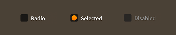
Radio components skinned with MetalWorksMobileThemeUsing ToggleGroup
If no ToggleGroup is provided, a Radio will automatically add itself to Radio.defaultRadioGroup. In general, though, you should always create a ToggleGroup for a distinct set of radio buttons.
var group:ToggleGroup = new ToggleGroup();

var radio1:Radio = new Radio();
radio1.label = "One";
radio1.toggleGroup = group;
this.addChild( radio1 );

var radio2:Radio = new Radio();
radio2.label = "Two";
radio2.toggleGroup = group;
this.addChild( radio2 );

var radio3:Radio = new Radio();
radio3.label = "Three";
radio3.toggleGroup = group;
this.addChild( radio3 );
Simply pass the ToggleGroup instance to the toggleGroup property of a Radio instance.
Listen for the Event.CHANGE event dispatched by the toggle group to know when the selected radio button has changed.
group.addEventListener( Event.CHANGE, group_changeHandler );
A listener might look like this:
function group_changeHandler( event:Event ):void
{
    var group:ToggleGroup = ToggleGroup( event.currentTarget );
    trace( "group.selectedIndex:", group.selectedIndex );
}
Use the selectedIndex to get the numeric index of the selected radio button (based on the order that the radio buttons were added to the toggle group). The selectedItem will reference the selected radio button directly:
var radio:Radio = Radio( group.selectedItem );
trace( "radio.label:", radio.label );
Skinning a Radio
A skinned Radio component usually has no background (or a transparent one) and the touch states of the radio are displayed through the icon skins. For full details about what skin and style properties are available, see the Radio API reference.
As mentioned above,
Radiois a subclass ofToggleButton. For more detailed information about the skinning options available toRadio, see How to use theToggleButtoncomponent.
User Experience
In general, a set of Radio controls should be used only when there are three or more choices that a user must make. If there are only two choices, a Check or a ToggleSwitch may be more appropriate. If there are so many choices that a set of Radio controls will fill a significant amount of space on screen, a PickerList is probably a better choice. The default item renderer of a PickerList is also a subclass of ToggleButton, so it's possible to style the list's items to look like radio buttons, if you prefer.