How to use the Label component (AS3/Starling version)
The Label component is for displaying text. It uses a text renderer.
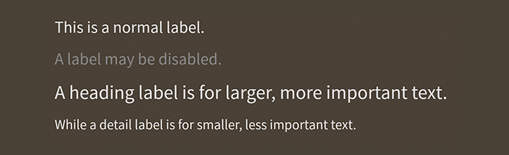
Label components skinned with MetalWorksMobileThemeThe Basics
First, let's create a Label control, give it some text to display, and add it to the display list:
var label:Label = new Label();
label.text = "I am the very model of a modern Major General";
this.addChild( label );
The text may be wrapped if it is too long to fit on one line:
label.width = 100;
label.wordWrap = true;
Set the wordWrap property to true to enable wrapping.
Skinning a Label
A number of styles may be customized on a label, including the font styles, the background skin, and padding. For full details about which properties are available, see the Label API reference. We'll look at a few of the most common ways of styling a label below.
Font styles
The font styles of the label may be customized using the fontStyles property.
label.fontStyles = new TextFormat( "Helvetica", 20, 0x3c3c3c );
Pass in a starling.text.TextFormat object, which will work with any type of text renderer.
If the label should use different font styles when it is disabled, you may set the disabledFontStyles property too:
label.disabledFontStyles = new TextFormat( "Helvetica", 20, 0x9a9a9a );
Background skin
Let's give the label a background skin that stretches to fill the entire width and height of the label. In the following example, we pass in a starling.display.Image, but the skin may be any Starling display object:
var skin:Image = new Image( texture );
skin.scale9Grid = new Rectangle( 2, 2, 1, 6 );
label.backgroundSkin = skin;
It's as simple as setting the backgroundSkin property.
We can give the label a different background when it is disabled:
var skin:Image = new Image( texture );
skin.scale9Grid = new Rectangle( 1, 3, 2, 6 );
label.backgroundDisabledSkin = skin;
The backgroundDisabledSkin is displayed when the label is disabled. If the backgroundDisabledSkin isn't provided to a disabled label, it will fall back to using the backgroundSkin in the disabled state.
Layout
Similar to many Feathers components, a Label provides several properties to add padding around its content:
label.paddingTop = 15;
label.paddingRight = 20;
label.paddingBottom = 15;
label.paddingLeft = 20;
If all four padding values should be the same, you may use the padding property to set them all at once:
label.padding = 20;
Change the text renderer
By default, a Label will use the global FeathersControl.defaultTextRendererFactory() to create its text renderer. If you want to change the type of text renderer used by an individual Label, you can provide a custom factory:
label.textRendererFactory = function():ITextRenderer
{
	return new TextBlockTextRenderer();
};
If the textRendererFactory property is not null, it will be used instead of FeathersControl.defaultTextRendererFactory().
The fontStyles property will work with any type of text renderer.