How to use the Alert component (AS3/Starling version)
The Alert class renders a window as a pop-up over all other content. Typically, an alert displays a header with a title, followed by some multiline text and an optional icon. A set of buttons to select different actions appears at the bottom of the alert.
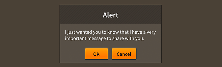
Alert component skinned with MetalWorksMobileThemeThe Basics
We create an Alert a bit differently than other components. Rather than calling a constructor, we call the static function Alert.show(). Let's see how this works by displaying a simple message in an Alert when we touch a button. First, let's create the button:
var button:Button = new Button();
button.label = "Click Me";
button.addEventListener( Event.TRIGGERED, button_triggeredHandler );
this.addChild( button );
Then, in the listener for the button's Event.TRIGGERED event, we create the alert:
function button_triggeredHandler( event:Event ):void
{
	var button:Button = Button( event.currentTarget );
	var alert:Alert = Alert.show( "I have something important to say", "Warning", new ArrayCollection(
	[
		{ label: "OK", triggered: okButton_triggeredHandler }
	]) );
}
Three arguments are required. The first is the alert's message. The second argument is the title displayed in the alert's header. Finally, a collection of button data must be passed in to display in a ButtonGroup.
In addition to listening for Event.TRIGGERED to be dispatched by individual buttons, you may also listen for Event.CLOSE on the alert:
alert.addEventListener( Event.CLOSE, alert_closeHandler );
The event object's data property will contain the item from the ButtonGroup data provider that is associated with the button that was triggered:
function alert_closeHandler( event:Event, data:Object ):void
{
	if( data.label == "OK" )
	{
		// the OK button was clicked
	}
}
Additional, optional arguments are available for Alert.show(). Let's take a look at those next.
Icon
An optional icon may be displayed next to the alert's message. We'll use a starling.display.Image in the following example, but the icon may be any Starling display object:
var icon:Image = new Image( iconTexture );
Alert.show( message, title, buttons, icon );
Pass in the icon after the alert's buttons.
Modality
Following the icon is the isModal argument. This determines whether there is an overlay between the alert and the rest of the display list. When an alert is modal, the overlay blocks touches to everything that appears under the alert. If the alert isn't modal, there will be no overlay to block the touch, and anything below the alert will remain interactive.
Alerts are displayed using the PopUpManager. By default, modal overlays are managed by the PopUpManager, but you can give a custom overlay to all alerts (that will be different from other modal pop-ups) when you set the static property, overlayFactory:
Alert.overlayFactory = function():DisplayObject
{
	var tiledBackground:Image = new Image( texture );
	tiledBackground.tileGrid = new Rectangle();
	return tiledBackground;
};
When PopUpManager.addPopUp() is called to show the alert, the custom overlay factory will be passed in as an argument.
Centering
Following the modality is the isCentered argument. This determines if the alert will be globally centered on the Starling stage. If the alert or the stage is resized, the alert will be automatically repositioned to remain centered.
Custom Alert factory
When an alert is created with Alert.show(), the function stored by the Alert.alertFactory() property is called to instantiate an Alert instance. One of the final arguments of Alert.show() allows you to specify a custom alert factory. This let's you customize an individual alert to be different than other alerts. For instance, let's say that a particular alert should have different background skin than others. We might create an alert factory function like this:
function customAlertFactory():Alert
{
	var alert:Alert = new Alert();
	alert.styleNameList.add( "custom-alert" );
	return alert;
};
Alert.show( "I have something important to say", "Alert Title", new ArrayCollection({label: "OK"}), true, true, customAlertFactory );
If you're working with a theme, you can set a custom styling function for a Alert with the style name "custom-alert" to provide different skins for this alert.
Skinning an Alert
A number of styles may be customized on an alert, including the message font styles, the background skin, and an optional icon. Additionally, alert has some sub-components that may be styled, including the header and the button group. For full details about which properties are available, see the Alert API reference. We'll look at a few of the most common ways of styling an alert below.
Font styles
The font styles of the alert's message may be customized using the fontStyles and disabledFontStyles properties:
alert.fontStyles = new TextFormat( "Helvetica", 20, 0x3c3c3c );
alert.disabledFontStyles = new TextFormat( "Helvetica", 20, 0x9a9a9a );
Pass in a starling.text.TextFormat object, which will work with any type of text renderer.
The font styles of the alert's title may be customized on the alert's Header component. See How to use the Header component for details.
The font styles of the alert's buttons may be customized through the alert's ButtonGroup component. See How to use the ButtonGroup component for details.
Background skin
The background skin fills the full width and height of the alert. In the following example, we pass in a starling.display.Image, but the skin may be any Starling display object:
var skin:Image = new Image( enabledTexture );
skin.scale9Grid = new Rectangle( 2, 4, 3, 8 );
alert.backgroundSkin = skin;
It's as simple as setting the backgroundSkin property.
A separate backgroundDisabledSkin may be provided to display when the alert is disabled:
var disabledSkin:Image = new Image( disabledTexture );
disabledSkin.scale9Grid = new Rectangle( 2, 4, 3, 8 );
alert.backgroundDisabledSkin = disabledSkin;
If the backgroundDisabledSkin isn't provided to a disabled alert, it will fall back to using the default backgroundSkin in the disabled state.
Layout
Padding may be added around the edges of the alert. This padding is applied around the edges of the message text renderer, and is generally used to show a bit of the background as a border.
alert.paddingTop = 15;
alert.paddingRight = 20;
alert.paddingBottom = 15;
alert.paddingLeft = 20;
If all four padding values should be the same, you may use the padding property to quickly set them all at once:
alert.padding = 20;
If an optional icon is displayed, you may use the gap property to add some space between the message and the icon:
alert.gap = 12;
Skinning the header
This section only explains how to access the header sub-component. Please read How to use the Header component for full details about the skinning properties that are available on Header components.
With a Theme
If you're creating a theme, you can target the Alert.DEFAULT_CHILD_STYLE_NAME_HEADER style name.
getStyleProviderForClass( Header )
	.setFunctionForStyleName( Alert.DEFAULT_CHILD_STYLE_NAME_HEADER, setAlertHeaderStyles );
The styling function might look like this:
private function setAlertHeaderStyles( header:Header ):void
{
	header.backgroundSkin = new Image( headerBackgroundTexture );
	header.fontStyles = new TextFormat( "Helvetica", 16, 0x3c3c3c );
}
You can override the default style name to use a different one in your theme, if you prefer:
alert.customHeaderStyleName = "custom-header";
You can set the styling function for the customHeaderStyleName like this:
getStyleProviderForClass( Header )
	.setFunctionForStyleName( "custom-header", setAlertCustomHeaderStyles );
Without a Theme
If you are not using a theme, you can use headerFactory to provide skins for the alert's header:
alert.headerFactory = function():Header
{
	var header:Header = new Header();

	//skin the header here, if you're not using a theme
	header.backgroundSkin = new Image( headerBackgroundTexture );
	header.fontStyles = new TextFormat( "Helvetica", 16, 0x3c3c3c );

	return header;
}
Skinning the buttons
This section only explains how to access the button group sub-component. Please read How to use the ButtonGroup component for full details about the skinning properties that are available on ButtonGroup components.
With a Theme
If you're creating a theme, you can target the Alert.DEFAULT_CHILD_STYLE_NAME_BUTTON_GROUP style name.
getStyleProviderForClass( ButtonGroup )
	.setFunctionForStyleName( Alert.DEFAULT_CHILD_STYLE_NAME_BUTTON_GROUP, setAlertButtonGroupStyles );
The styling function might look like this:
private function setAlertButtonGroupStyles( group:ButtonGroup ):void
{
	group.gap = 20;
}
You can override the default style name to use a different one in your theme, if you prefer:
alert.customButtonGroupStyleName = "custom-button-group";
You can set the styling function for the customButtonGroupStyleName like this:
getStyleProviderForClass( ButtonGroup )
	.setFunctionForStyleName( "custom-button-group", setAlertCustomButtonGroupStyles );
Without a Theme
If you are not using a theme, you can use buttonGroupFactory to provide skins for the alert's button group:
alert.buttonGroupFactory = function():Header
{
	var group:ButtonGroup = new ButtonGroup();

	//skin the button group here, if you're not using a theme
	group.gap = 20;

	return group;
}
Using a factory to skin an Alert without a theme
If you're not using a theme, you can specify a factory to create the alert, including setting skins, in a couple of different ways. The first is to set the Alert.alertFactory static property to a function that provides skins for the alert. This factory will be called any time that Alert.show() is used to create an alert.
function skinnedAlertFactory():Alert
{
	var alert:Alert = new Alert();
	alert.backgroundSkin = new Image( texture );
	// etc...
	return alert;
};
Alert.alertFactory = skinnedAlertFactory;
Another option is to pass an alert factory to Alert.show(). This allows you to create a specific alert differently than the default global Alert.alertFactory.
function skinnedAlertFactory():Alert
{
	var alert:Alert = new Alert();
	alert.backgroundSkin = new Image( texture );
	// etc...
	return alert;
};
Alert.show( message, title, buttons, isModal, isCentered, skinnedAlertFactory );
You should generally always skin the alerts with a factory or with a theme instead of passing the skins to the Alert instance returned by calling Alert.show(). If you skin an alert after Alert.show() is called, it may not necessarily be positioned or sized correctly anymore.
Closing and disposal
The alert will automatically remove itself from the display list and dispose itself when one of its buttons is triggered. In most cases, you don't need to do any kind of cleanup.
To manually close and dispose the alert without triggering a button, you may simply remove the alert from its parent:
alert.removeFromParent( true );